The Barrel Society
Branding a Curated Spirits Experience Visual identity and collateral for a whiskey tasting club.
Project Snapshot
Industry
: Hospitality, Lifestyle & Consumer BrandsServices
: Brand Strategy · Visual Identity · Packaging · Copywriting · Collateral DesignChallenge
: Create a premium identity for a curated beverage membership experience, balancing exclusivity, warmth and connoisseurship.Outcome
: A polished identity system that created a premium, collectible and club-worthy vibe across packaging, membership materials and brand communications.
When people gather to discuss something that they’re passionate about, something special can happen. This was the case for an informal and diverse group who regularly gathered to taste and share their love of single malt whiskey. Eventually, the core group decided to formalize their get togethers under the auspices of a Scotch tasting club. They approached Overdrive to create a visual identity for this new club they had named The Barrel Society.
This is no stuffy bastion of founding fathers, it's a diverse, vital and lively collective of like-minded folk from many walks of life who appreciate the lure of a good dram. What The Barrel Society needed was an identity that married that reverence, and respect for the tradition of whiskey making, with its very modern membership.

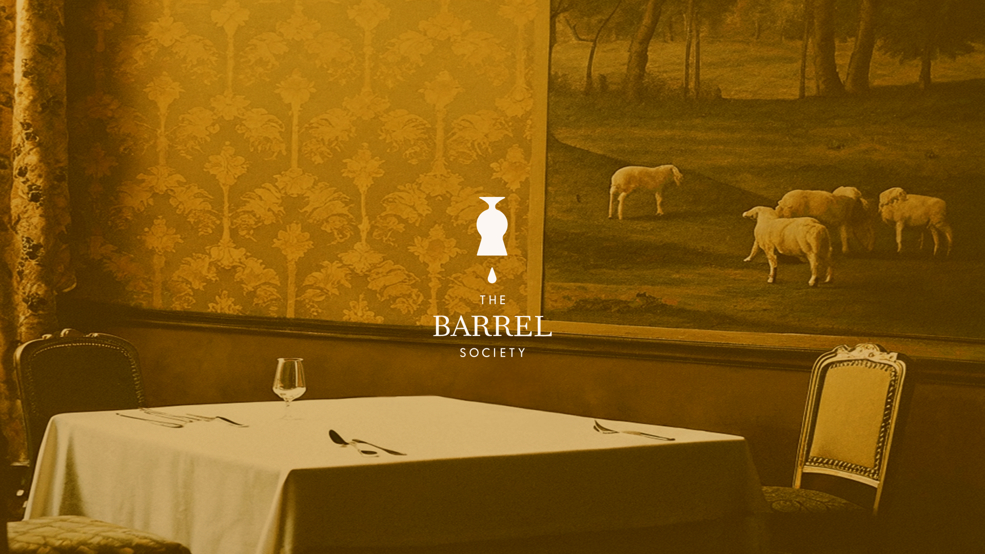
Logo
The Barrel Society logo is comprised of both a word mark and symbol. It presents a clean, non fussy esthetic. By employing all caps, the word mark feels bold, yet the combination of serif and san serif fonts adds finesse – like the combination of a strong nose and subtle finish. At first glance, the logo appears masculine, but this is tempered by the feminine silhouette of the inverted Vinum whiskey glass. The result is a logo that balances a 21st century dynamism with the tradition and story of single malt.
Where story takes shape


The design aficionado is invited to note the layers of meaning found in the symbol. The inverted whisky glass when seen as negative space reveals a keyhole – suggesting that the viewer, by looking through the keyhole, will be shown something special. That’s what the Barrel Society does, invites its members to experience the rarefied. And the drop represents both an invitation to taste and a nod to what’s lost to the heavens, the so called “Angel’s Share”. Each element is more than shape—it’s story.
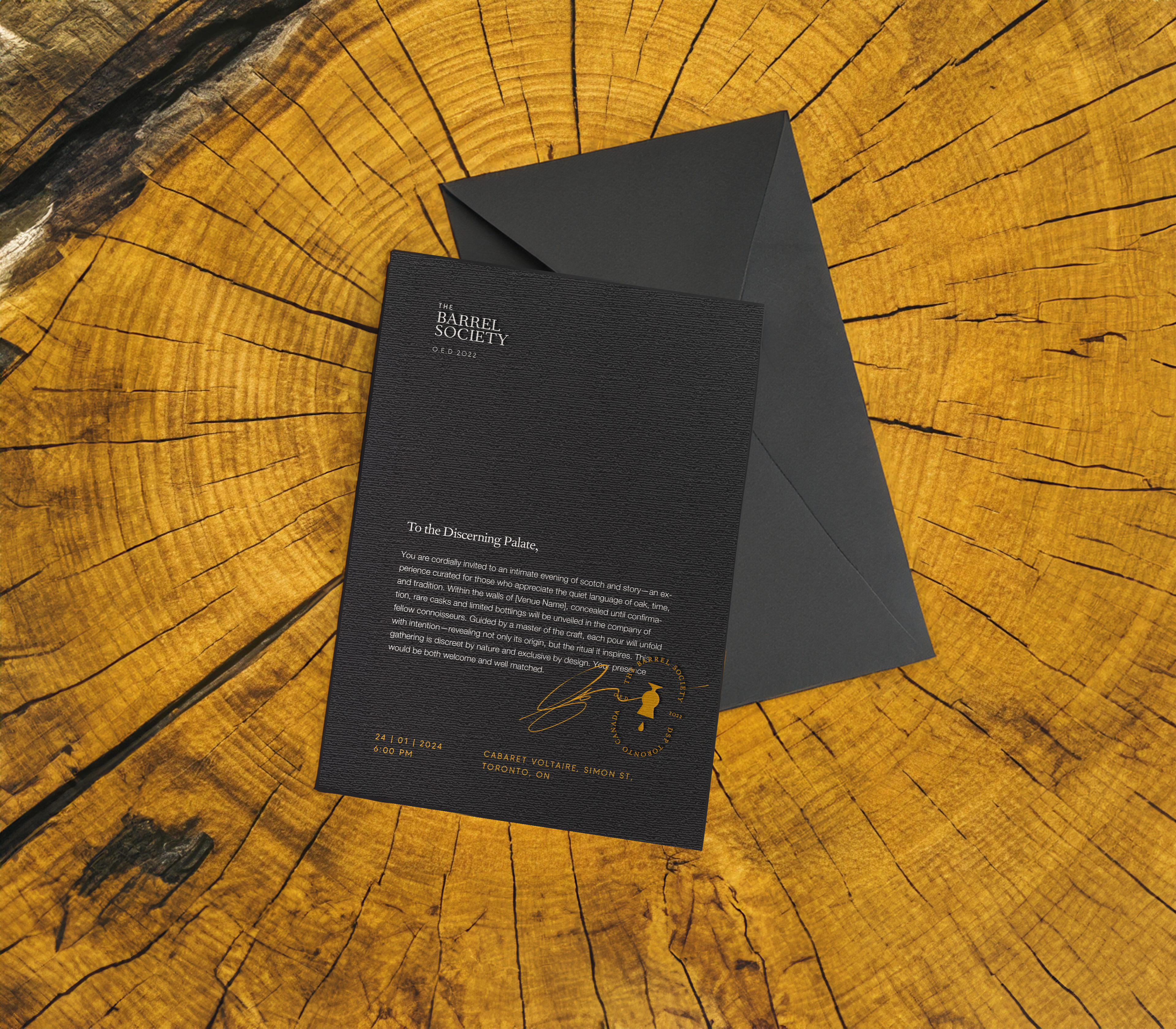
Colour
The palette for The Barrel Society draws from Single Malt itself, and the barrels that hold it. Charred Oak, a deep near-black, anchors the brand and provides depth, “Ambrosia,” a golden caramel, glows like whisky and is used as an accent sparingly to signal richness and rarity. To balance these colours, we added “Bone “ to brings clarity and softness. Together, these colours contribute to a restrained, elegant feel that enhances the logo.

Signs of an Insider
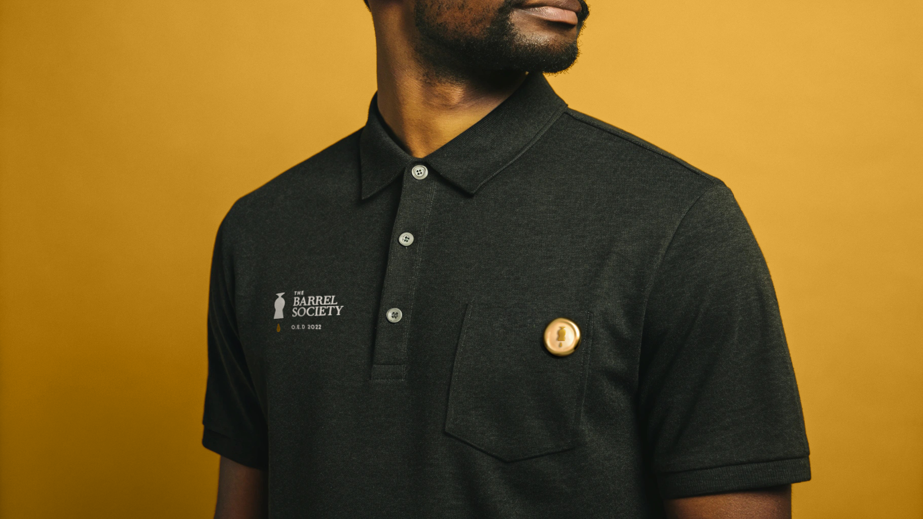
The Barrel Society’s collateral contributes to the sense of connection and identity among members, yet is also designed so that it exists comfortably out in the world. We explored a variety of items that could be produced for the group, including embroidered polos, aprons, tasting notebooks, flasks, printed menus, pins, and blind-embossed stationery to promote the club.


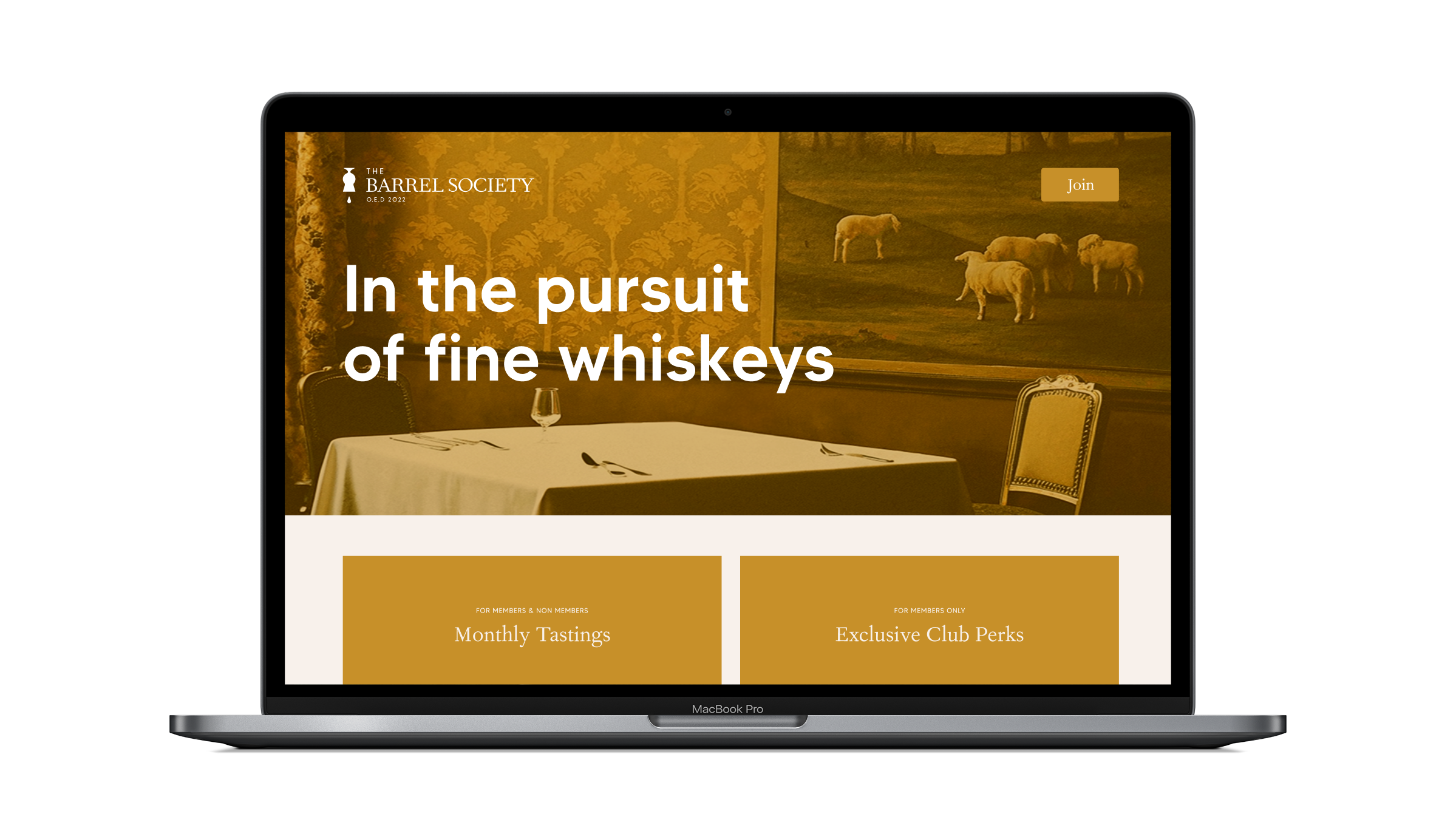
Website Design and Development
The Barrel Society website includes subtle animations to bring the key elements—like the glass, keyhole, and drop—to life, adding depth without distraction. The layout is minimal, allowing the story and textures to speak. Built with a private membership system, the site offers a seamless experience for members.
Credits
Overdrive Design Ltd. Creative Concepts, Design, and Development
The Barrel Society is a a brand built for those who appreciate nuance, tradition, and “the good stuff” shared in good company.
“James and the team perfectly captured the spirit of our whisky club. Their attention to detail and creative flair resulted in a clever, sophisticated, and memorable look that has genuinely elevated our club's presence. We couldn't be happier with the results.” Marc Jamieson


