Lolly Cannabis
High Design: Crafting the Lolly Aesthetic
Deliverables
- Logo
- Illustration
- Website design and development
In 2020 Overdrive was hired by Danielle Braemer to develop a visual identity for a new Cannabis retail store. When we first came aboard the project, the company name, Lolly, was being debated. Investors were nervous about it sounding too childlike. We loved the name and made a visual case for its adoption. Ultimately, it won the day as it aligned well with strategy and the principal’s aspirations. It has an undeniably positive and happy tone.
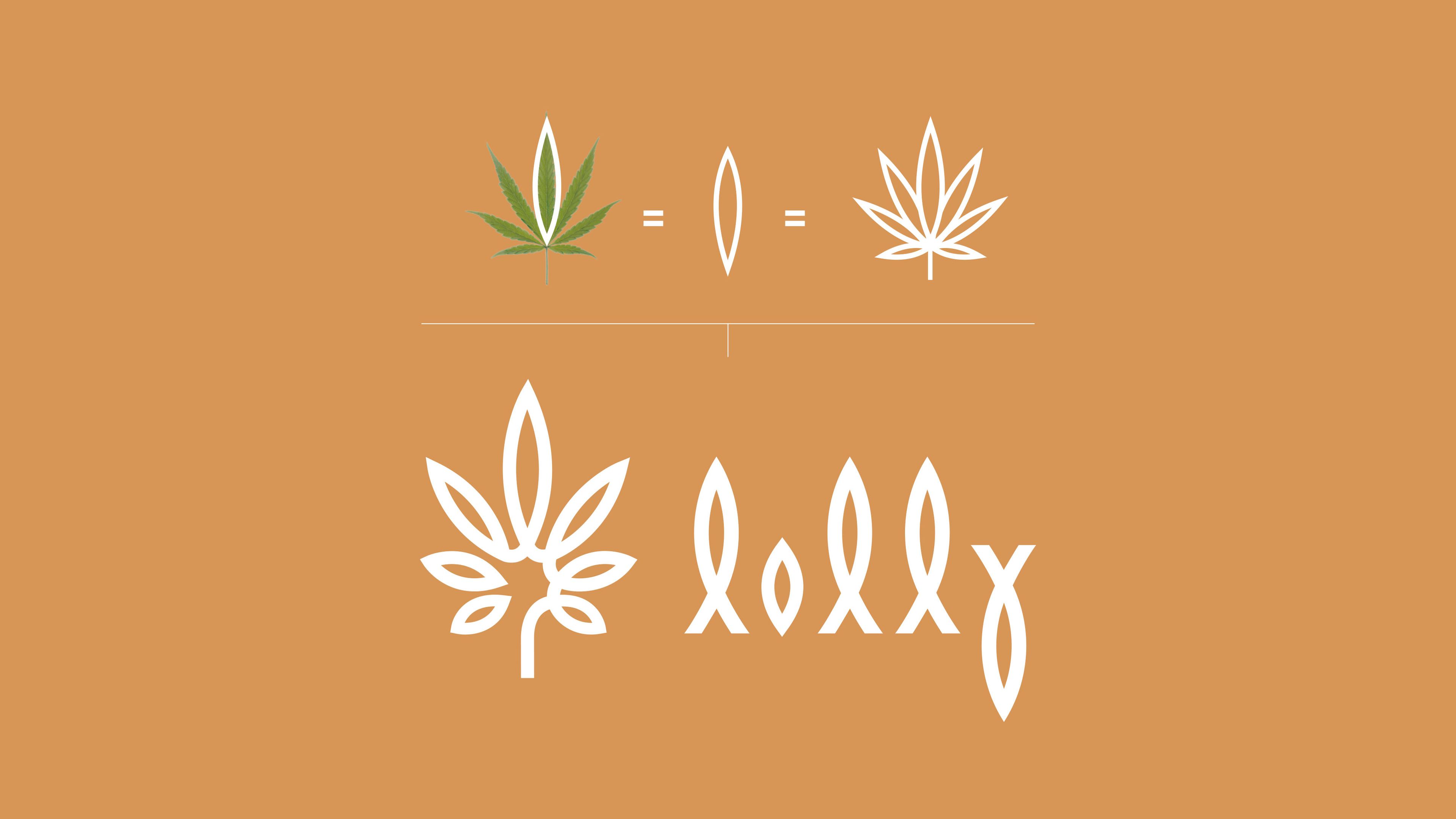
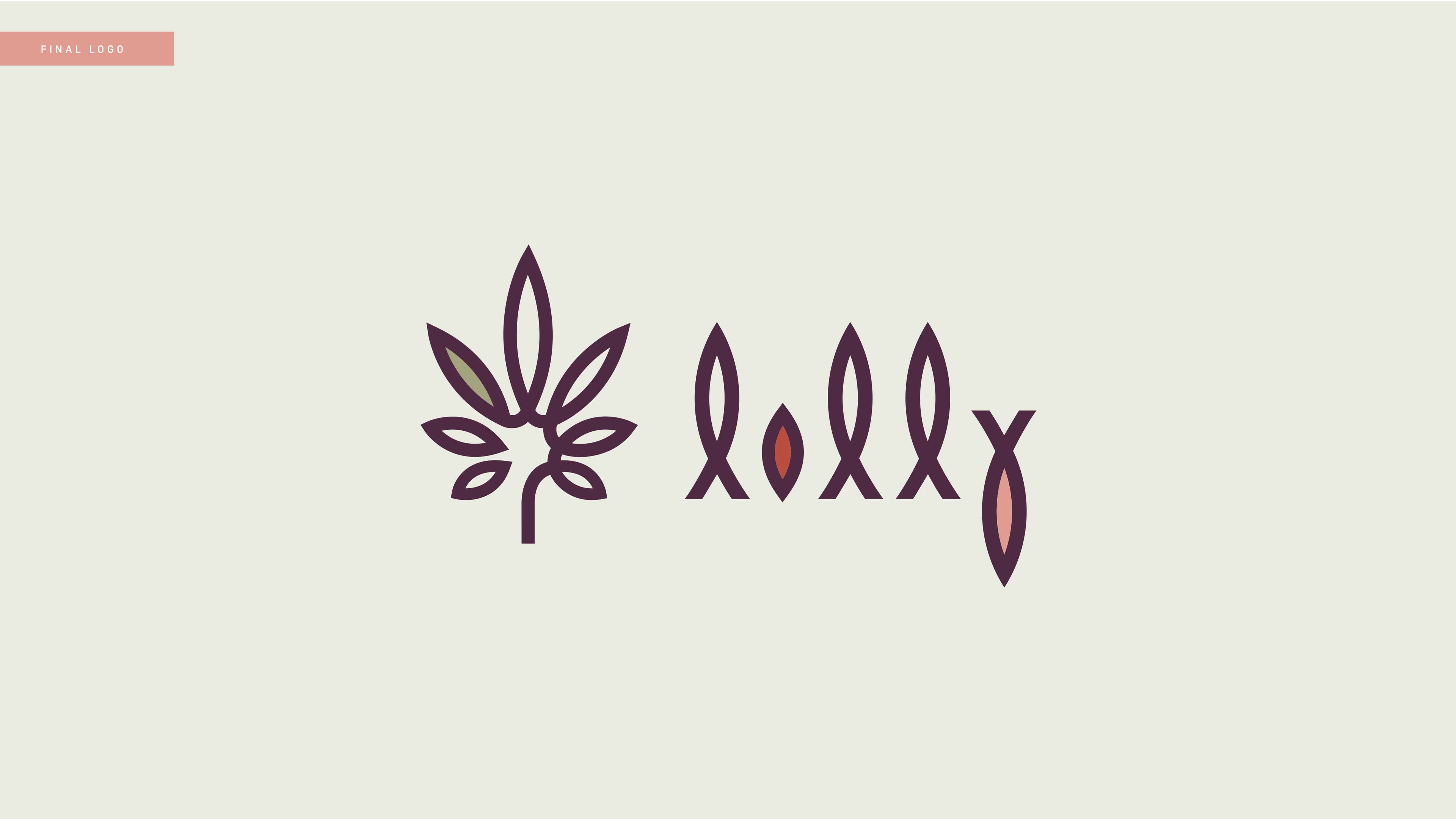
Overdrive crafted Lolly Cannabis' brand identity in close collaboration with founder Danielle Braemer, an accomplished interior designer with eclectic tastes. The form of the logo began in cursive with the loops, pattern and rhythm informing a more graphic approach. The beauty of it is in its simplicity. The logo is reduced to a single shape that is reflected, rotated and scaled.
Epicureanism and femininity were inspirations for the project and both elements are reflected in the basic forms. To avoid the letterform resembling a religious symbol, the stress of the letterforms are through the center and the bowl of the letterform is created in perfect symmetry using the golden ratio.


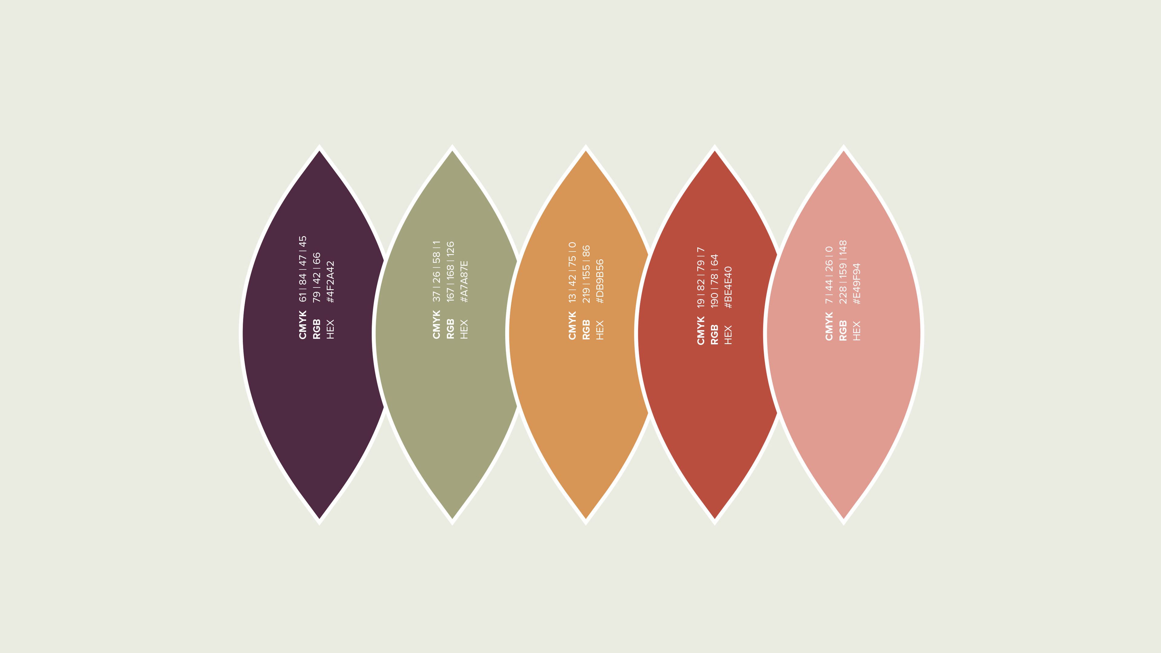
Palette
The colour palette is inspired by botanical drawings, south-western colour palettes, and earth-tones, all personal preferences of the client but on strategy and therefore on brand.

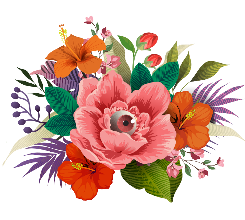
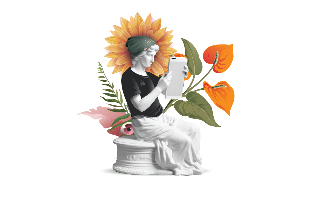
Illustration
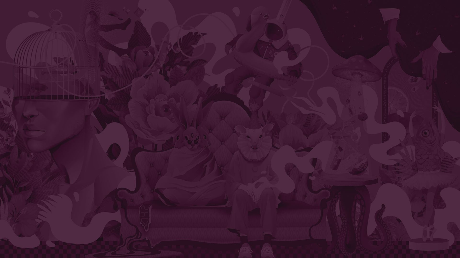
Overdrive created custom illustration for Lolly, as well as spot collage compositions. Founder Danielle Braemar’s interest in surrealism is reflected in the central illustration, designed for scalability – from murals to websites and skateboard decks, an example of Overdrive's build once, deploy many ways approach.
“Build once, deploy many ways.”


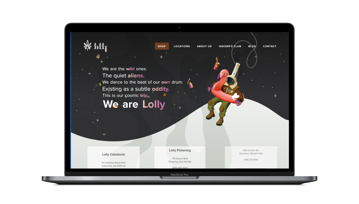
Website design & development
The Lolly website was a painstaking process. It was always intended as a showcase for the original illustration, but as the site continued to evolve, elements of the illustration were extracted and animated to add interest and emphasis to different pages . The site was connected to an e-commerce platform to
Credits
Overdrive Design Ltd. - design, illustration, development Awards
Featured In
Applied Arts, 2024, Business Illustration
“The Wild Ones
Lolly was founded by a family and their friends. We dance to the rhythm of our own drum, laugh together, and savour life’s best moments together – and we get by with a little help from our friend..”


