The Roofers

Raising the Roof on a Regional Brand Logo Refresh, Visual Identity and Website Design for a Roofing Company
Project Snapshot
Client
: The RoofersIndustry
: Built Environment, Trades & Industrial BrandsServices
: Visual Identity · Logo Refresh · Brand Standards · Website Design and Development · Collateral · Icon DesignChallenge
: Refresh a roofing company’s identity after years of growth, preserving the equity of its original logo while creating a more streamlined, professional brand that reflected its expanded services and regional reach.Outcome
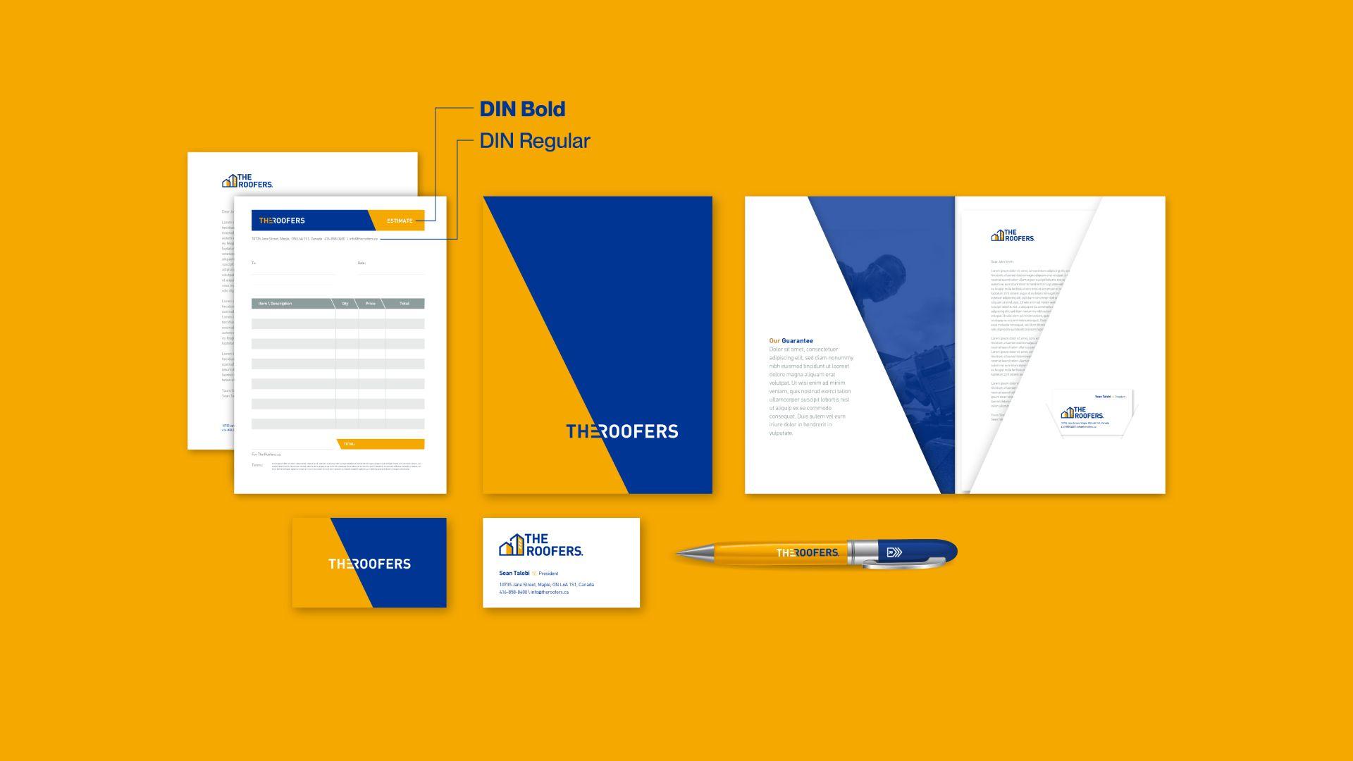
: A streamlined visual identity and website system that retained familiar brand cues while giving The Roofers a more professional, scalable presence across collateral, icons and digital communications.
The Roofers started small some 20 years ago with a conviction to tackle the roofing industry with a mandate to provide the best possible service to their customers. As their business expanded and developed more services, they realized that they had outgrown their old logo. They wanted a new identity and website that reflected their commitment to quality, and their now regional (rather than simply local) reach.


Logo Redesign
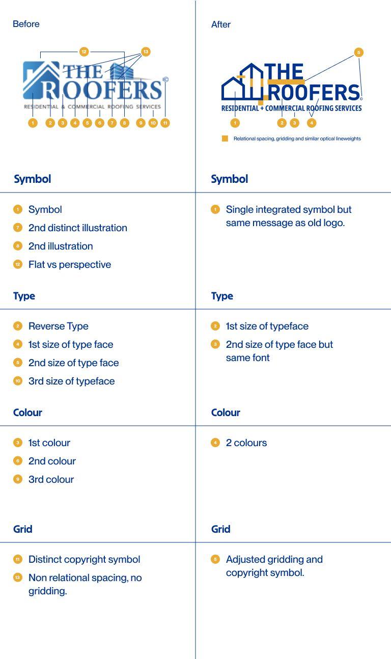
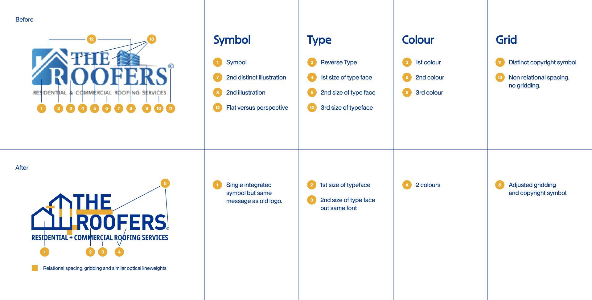
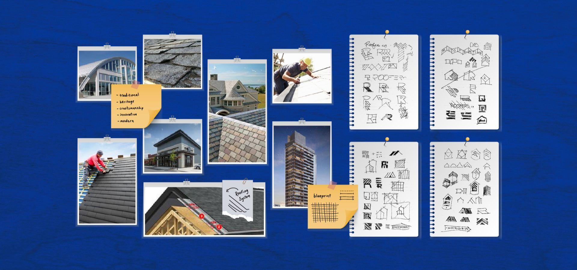
Our approach to the redesigning of this logo involved strategically incorporating elements from the original logo that hold some brand equity. We placed a strong emphasis on streamlining and simplifying the logo design.
To accomplish this, we amalgamated symbols and illustrations into a cohesive entity, reduced the number of type sizes to two, and narrowed down the colour scheme to a palette of two colours.