RamSoft

Accelerated Imaging Evolving the Identity of a Radiology SaaS and PACS Brand
Project Snapshot
Client
: RamSoftIndustry
: Healthcare Wellness and Medical SciencesServices
: Visual Identity System · Brand Expression. Logo Evolution · Logo Symbol Design · Brand Standards · Website Design · UX/UIChallenge
: Evolve an established healthcare technology brand so it could stand confidently beside larger industry players, while still reflecting the responsiveness, customization and human service that made RamSoft a favourite with its clients.Outcome
: A refreshed identity system that brought greater sophistication and consistency to the RamSoft brand while giving its responsive, client-centred personality a clearer visual expression.
For nearly three decades, RamSoft has been pioneering radiology software that streamlines workflows and expands access to increasingly decentralized medical imaging worldwide. Founded in 1994 by Dr. Ramanathan and his son Vijay, the company has built a reputation for both technological excellence and an unwavering commitment to customer service.
Despite their forward-thinking innovations, RamSoft’s visual identity no longer reflected the momentum of their solutions or their company. Overdrive was brought in to reimagine their identity—designing a modern, elegant, and dynamic visual system that embodies speed of delivery while maintaining the clarity and trust that define RamSoft’s legacy.

Logo
RamSoft’s new logo balances elegance with technical precision, embodying a modern and friendly aesthetic that combines approachability with the SAS landscape. Designed to feel refined yet engineered, the custom typography features soft, rounded corners contrasted with squared counters and structural details, creating a sense of seamless motion that mirrors the speed and efficiency of RamSoft’s software. A key design element is the ft ligature, a subtle yet intentional connection symbolizing the company’s role in linking technology, healthcare, and patients. This concept extends across RamSoft’s entire product suite, with each product logo incorporating its own unique ligature—a simple yet powerful nod to the connectivity at the heart of RamSoft’s mission.

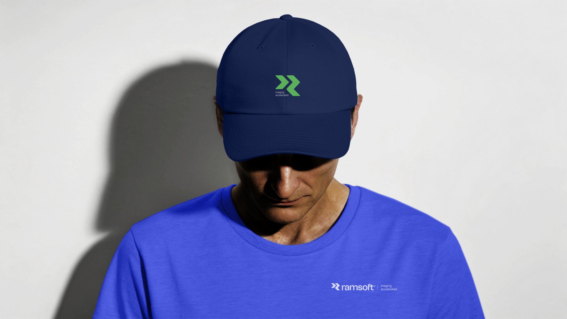
Symbol
The RamSoft symbol captures the essence of acceleration and speed through its dynamic chevron-inspired design, with its base shape subtly resembling an “R.” The forward-pointing chevrons symbolize progression, innovation, and a future-focused mindset, aligning with RamSoft’s mission to advance medical imaging technology. While the typography conveys elegance, technical precision, and connectivity, the symbol emphasizes speed and momentum, echoing the seamless experience RamSoft delivers with its products. Rounded corners and a technical aesthetic, drawn from the logo’s letterforms, ensure cohesion between the symbol and typography, creating a unified identity that reflects both the sophistication and innovation at the heart of RamSoft’s brand.

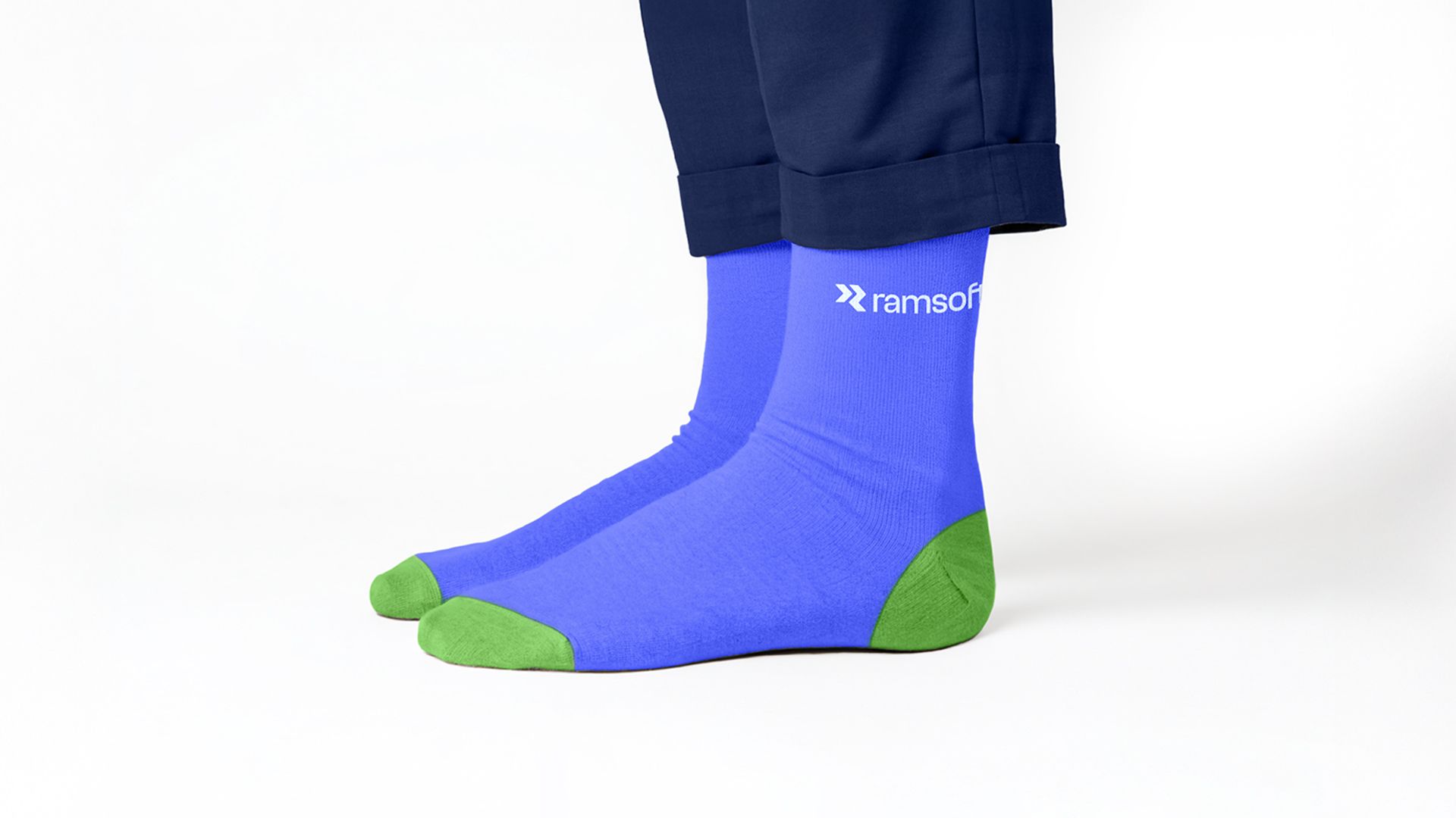
Collateral
From business cards and notebooks to apparel and social media, each design tells the story of RamSoft while embodying the speed and precision that define their brand.


Credits
Overdrive Design: Art Direction & Design
"Overdrive has been a trusted design partner for many years and has this amazing ability to create fresh, relevant and highly strategic identities that capture the nature and competitive advantages of a business and its products. I’m thrilled with the identity created by OverDrive Design and its successful application across our many analog, digital and environmentalchannels and implementations globally"
— Rob Sandler, RamSoft Chief Marketing Officer


