NIMMS

Portrait of The Bag Lady as a young sewist Boutique Brand Identity for a Bespoke Purse and Accessories Label
Project Snapshot
Industry
: Hospitality, Lifestyle & Consumer BrandsServices
: Brand Strategy · Visual Identity · Packaging · Copywriting · Brand ExpressionChallenge
: Create a sassy boutique identity for an indie purse brand, reflecting the bespoke, stylish nature of its products while connecting with a fashion audience focused on personal expressionOutcome
: A flexible fashion identity system that gave Nimms a polished, ownable presence across purses, accessories, packaging and brand communications.
Actor Niamh Wilson found herself in a lull between projects in fall of 2023, and was looking for a distraction. Taking notice of a sewing machine, she decided to make bags for family and friends for Christmas. The fact that she’d never sewn was merely a fleeting inconvenience. After teaching herself to sew with YouTube tutorials she produced her first generation of bags, and they were a hit, with many folks suggesting that she should sell her creations. Overdrive was one of those early cheerleaders—and Niamh reached out and asked if we could build her a basic brand package. She had a simple sketch idea of a sixties mod-inspired rendering of her childhood nickname, Nimm.
We took that concept and developed an identity and some basic collateral that reflects the fashion + funky vibe of the self professed “Bag Lady”. NIMMS bags are sold both online and at local pop-up markets like “Good Friends” in Toronto.
→ Visit nimms.ca

Logo
The “NIMMS” wordmark is built from a fluid, organic typeface that suggests creativity, and warmth. The repeated “M” shapes enhance the symmetry and rhythm of the wordmark, making it both playful and memorable. The irregular, soft shapes suggest the uniqueness of handmade goods and signals a connection to expressive personal style.
Of course, while the wordmark may look organic, it has been precisely gridded. Each letter’s positive and negative space is derived from one of four circle shapes. The gridded letter forms can then be constructed in a variety of ways – horizontal, a square, or vertical.
Inspiration
NIMMS original concept sketch alluded to the globular shapes of the ubiquitous lava lamp. We leaned into this concept for the formation of the letter forms, and then expanded the vision to encompass a spirit of spontaneity, bright and bold colours and and a playful fluidity that captures the expressive, handcrafted essence of the brand.


Collateral
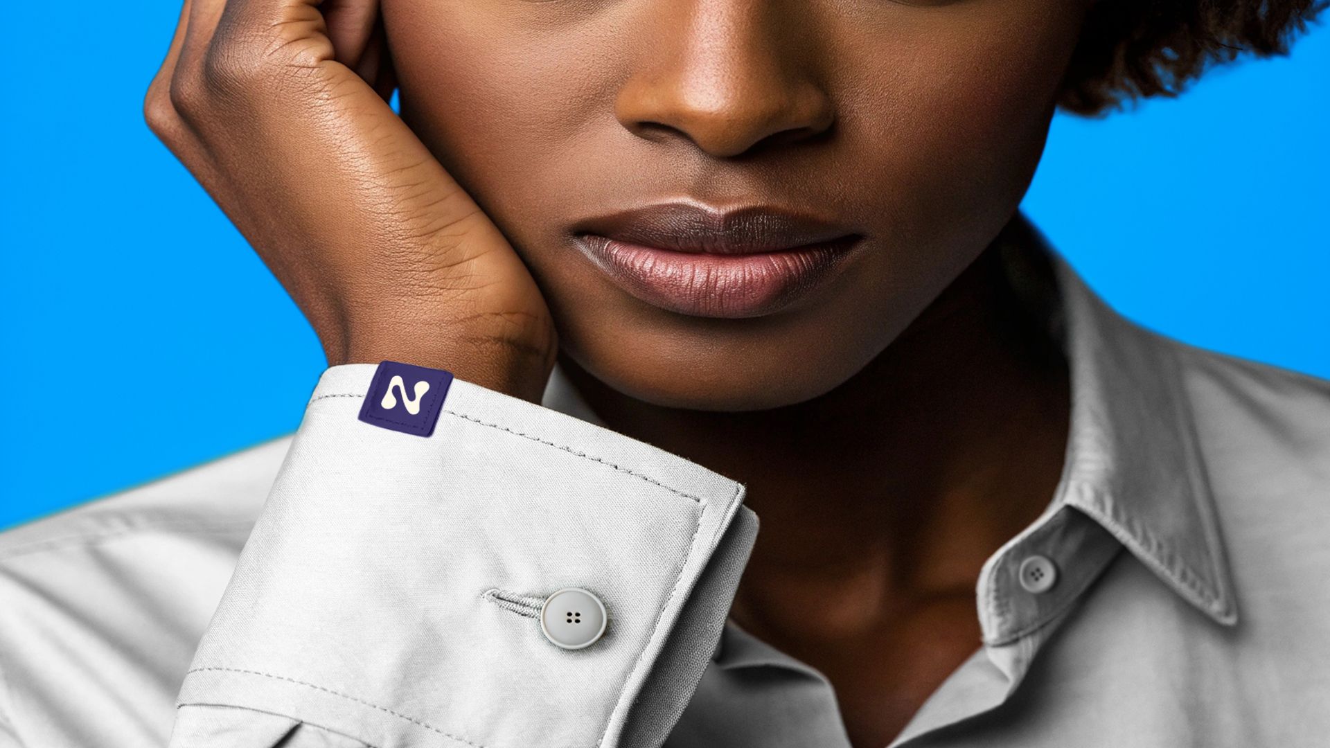
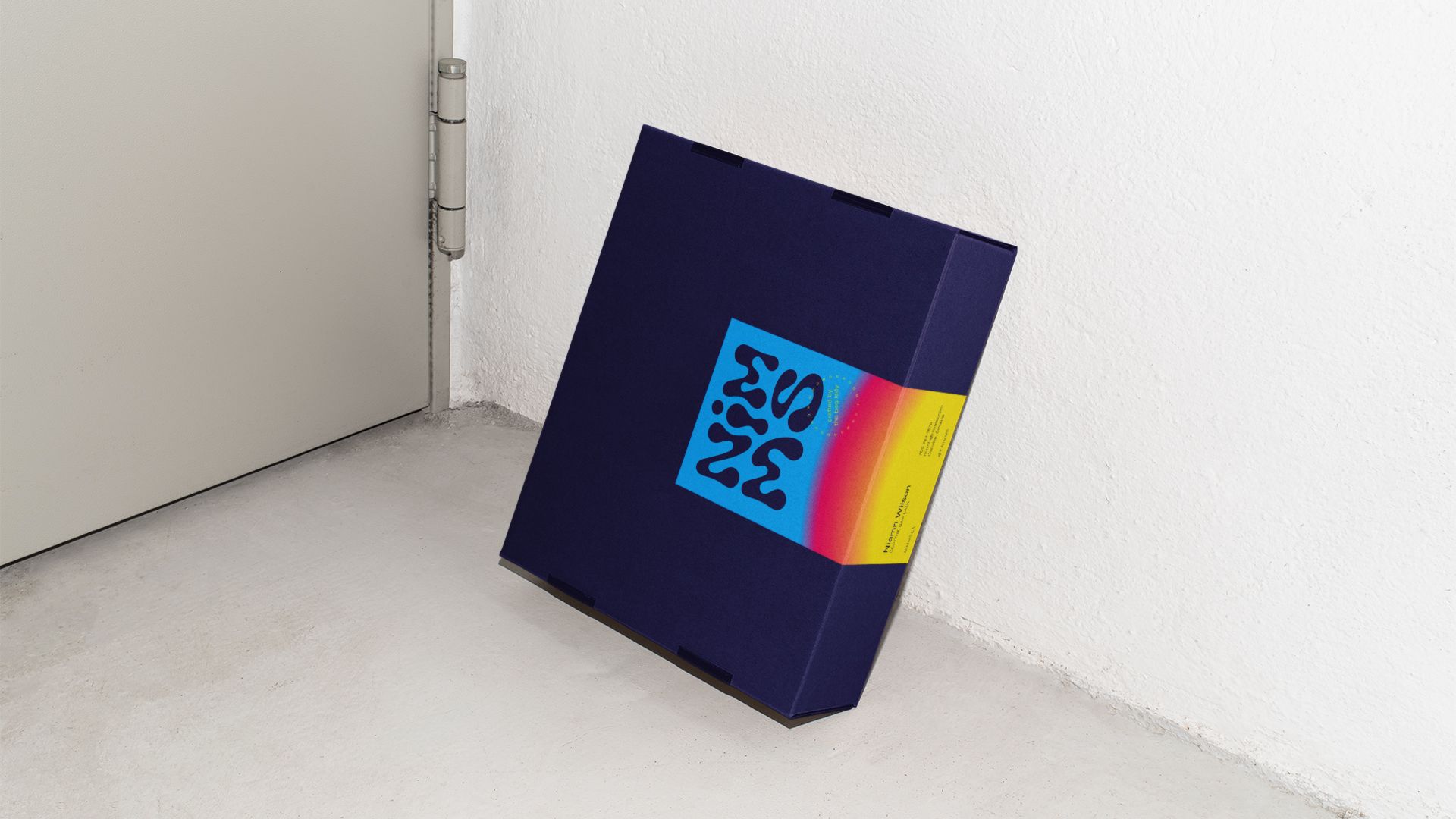
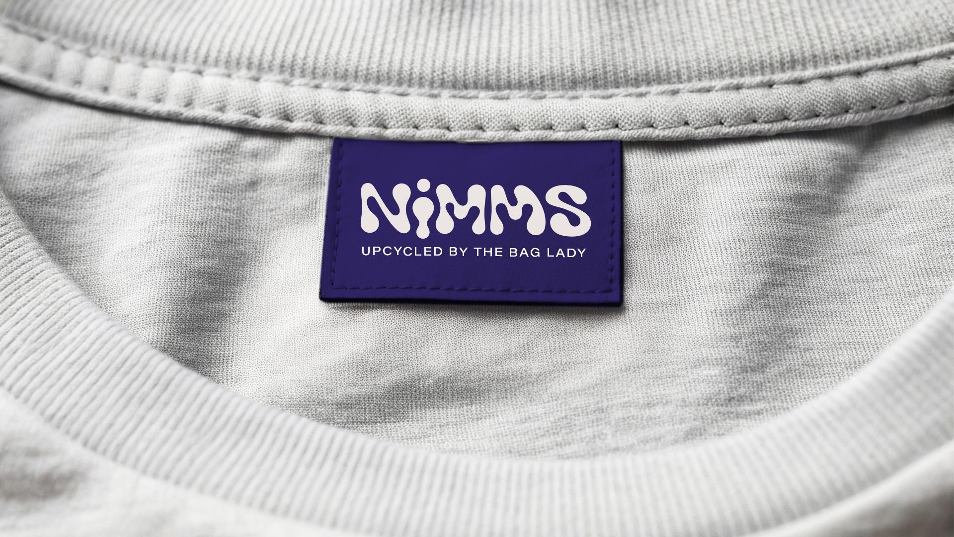
Horizontal, vertical or square versions of the logo can be deployed as needed, to hang tags, woven labels, cards, stickers, signage and more. Recently, NIMMS has branched out into upcycling everyday shirts into wow snatched tops with smocked bodices. This called for a new woven label, that would work well on a hem.






Credits
Overdrive Design Ltd.: Creative, concepts and design.
Photography Sam Coyle
Clothing design Thief and Bandit
“The branding that Overdrive created for me was the impetus I needed to take NIMMS to the next level."
— Niamh Wilson, NIMMS


