Heather and Little

Craftsmanship, Detail and Verdigris. Brand Identity and Website Design for a Heritage Architectural Metalwork Specialist
Project Snapshot
Client
: Heather and LittleIndustry
: Built Environment, Trades & Industrial BrandsServices
: Brand Strategy · Visual Identity · Website Design and Development · Copywriting · UI-UXChallenge
: Give an architectural metalwork company an identity worthy of their craft, drawing on Arts and Crafts influences and Heather & Little’s reputation for custom historic restoration; then applying the visual identity to their website.Outcome
: A cohesive brand and digital system that gave Heather & Little a refined, authoritative presence across identity, content, imagery and online navigation. A website rebuild that refined navigation, optimized imagery, SEO-conscious structure and detailed research-driven copy.
Founded in 1925, Heather & Little has been recognized as a premier fabricator of custom ornamental sheet metal and historic sheet metal restoration throughout North America. The company has worked on some of North America’s most significant landmark and heritage buildings, from the Thomas Jefferson Library of Congress in Washington D.C. to the Canadian Parliament Buildings.
Significant effort went into researching approaches for the new brand, and visual identity. Heather and Little needed an approach that would encapsulate the company’s craftsmanship, innovation and attention to detail. Ultimately we focused on a version that was influenced by the Arts and Crafts movement. Our design is meant to reference the look of a piece of stamped metal. The main type of metal used by H&L in their work is copper, therefore the logo was expressed as if reproduced on copper. The Verdigris treatment is both beautiful and a nod to the longevity of H&L’s work, which lasts for generations.
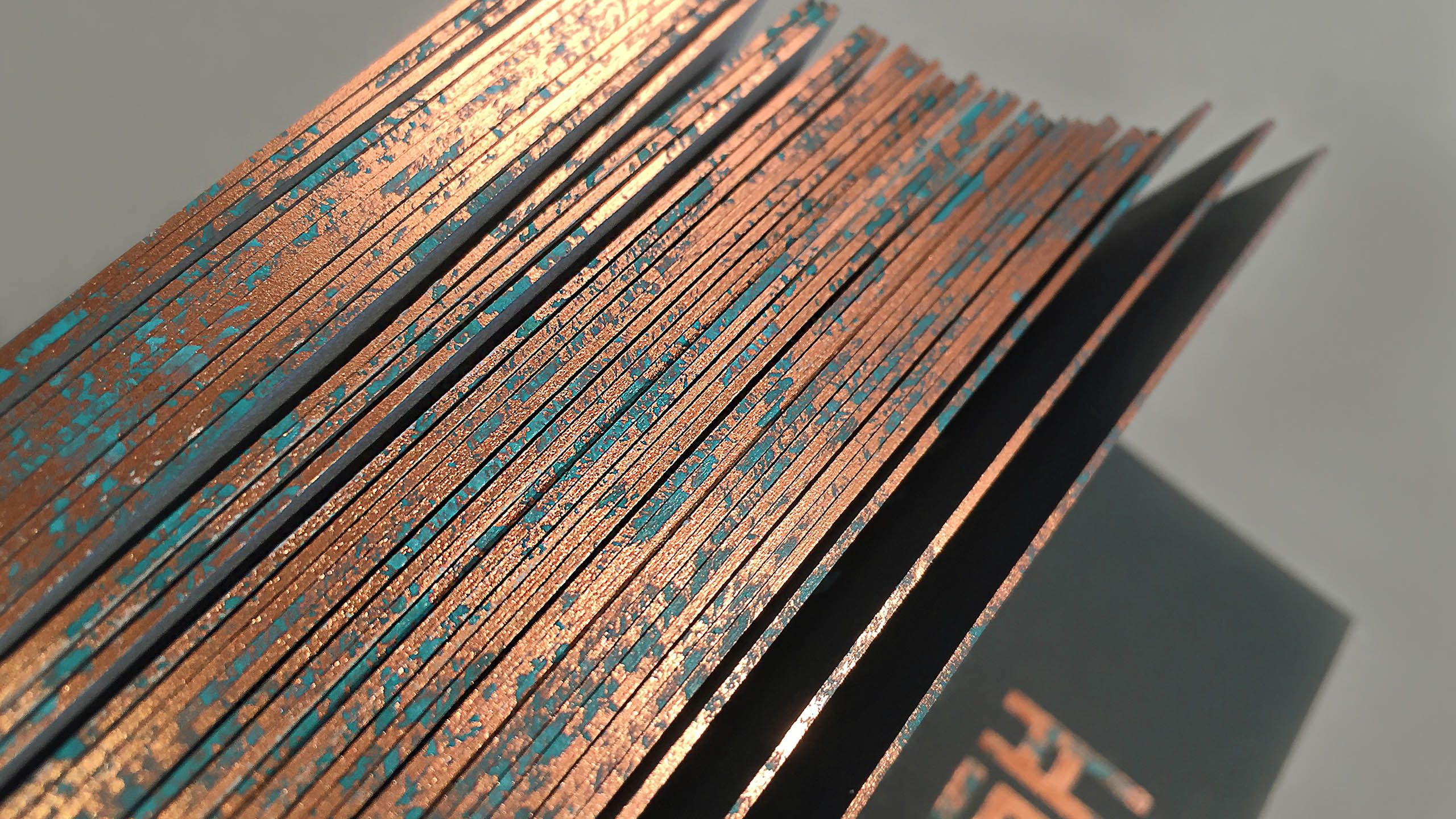
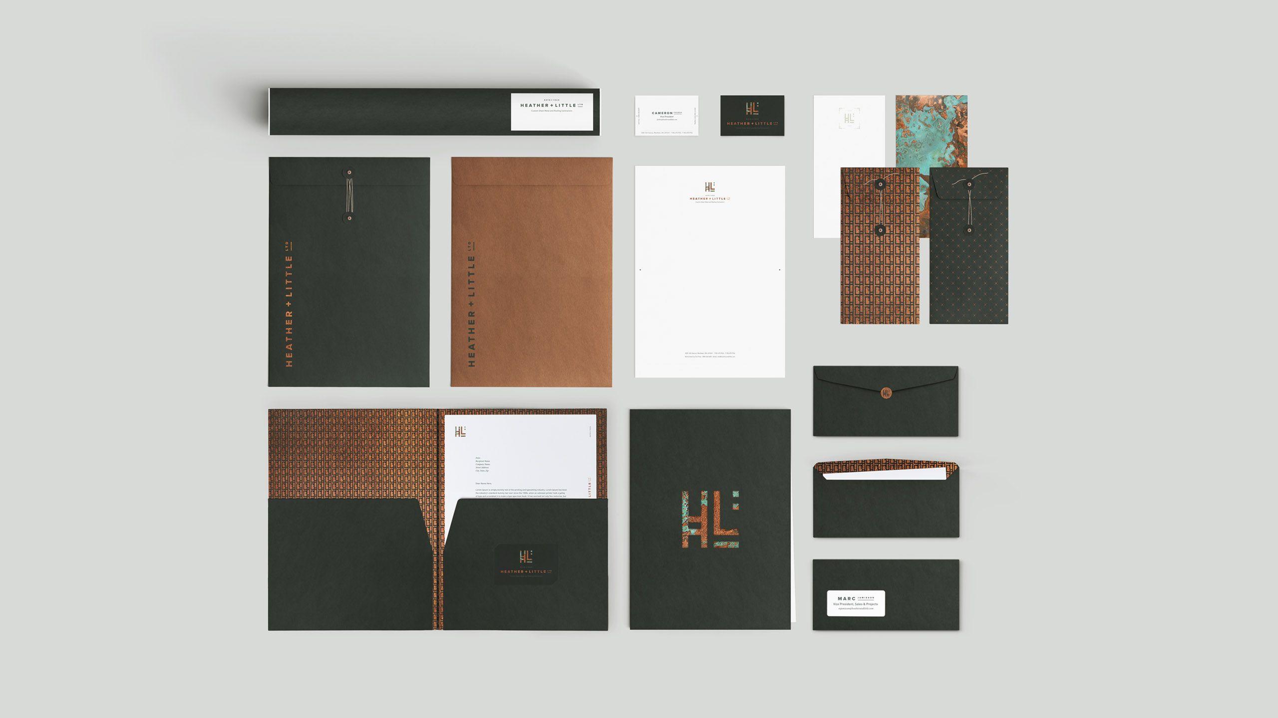
Printing the business cards proved to be extremely challenging to execute. All the printers contacted said the same thing: “we’ve never seen this done before”. Flash Reproductions took on the challenge. Hours of testing and press approvals later, the final result emerged. The identity was expressed in a variety of collateral materials, stationery, stickers, purchase orders. The centrepiece of the stationery, the business cards, went through 4 production processes and 5 finishing processes. 2 different types of paper, duplexed, litho printing, copper foil stamp using “printable” foil, silk screen spot custom “patina” colour UV cured ink, litho black and custom metallic brown on top of foil, copper gilded edges and, finally, hand painting custom “patina” colour on gilded edges.
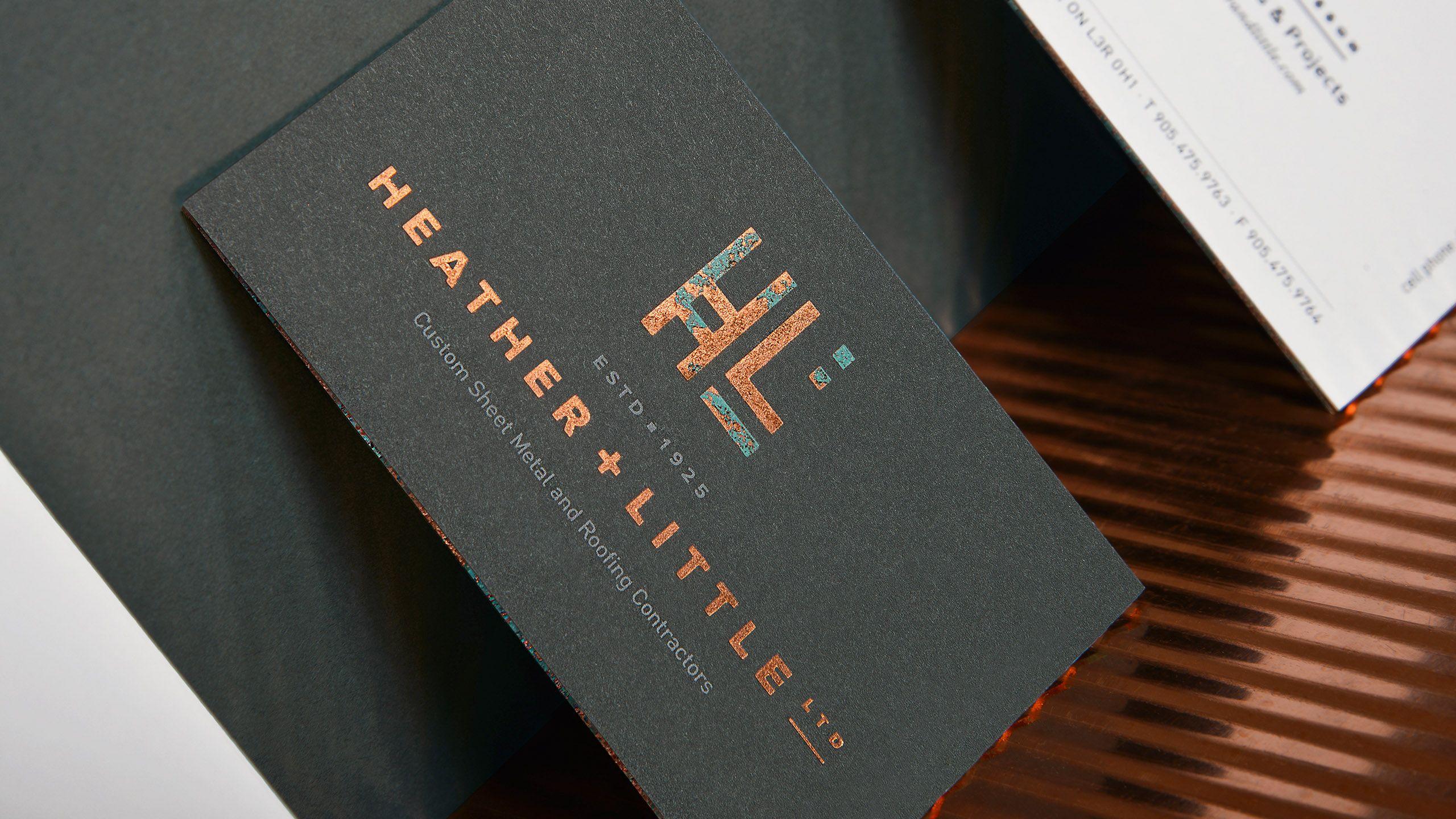
Business Cards
The centrepiece of the stationery, the business cards, went through four production processes and five finishing processes. It utilized two different types of paper, duplexed, litho printing, copper foil stamp using “printable” foil, silk screen spot custom “patina” colour UV cured ink, litho black and custom metallic brown on top of foil, copper gilded edges and, finally, hand painted custom “patina” colour on gilded edges.
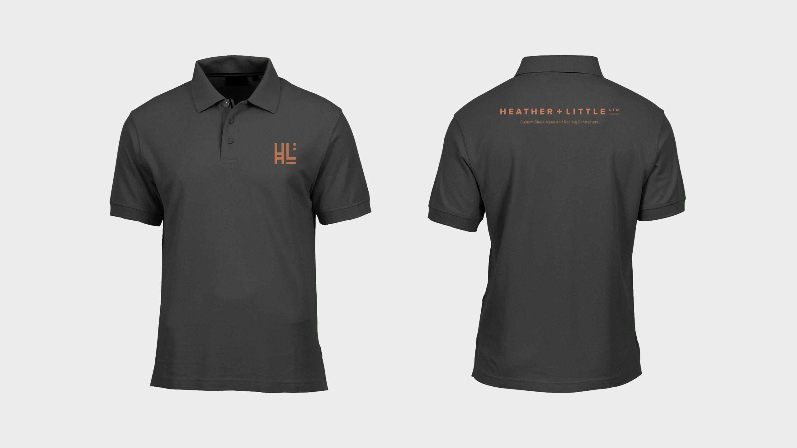
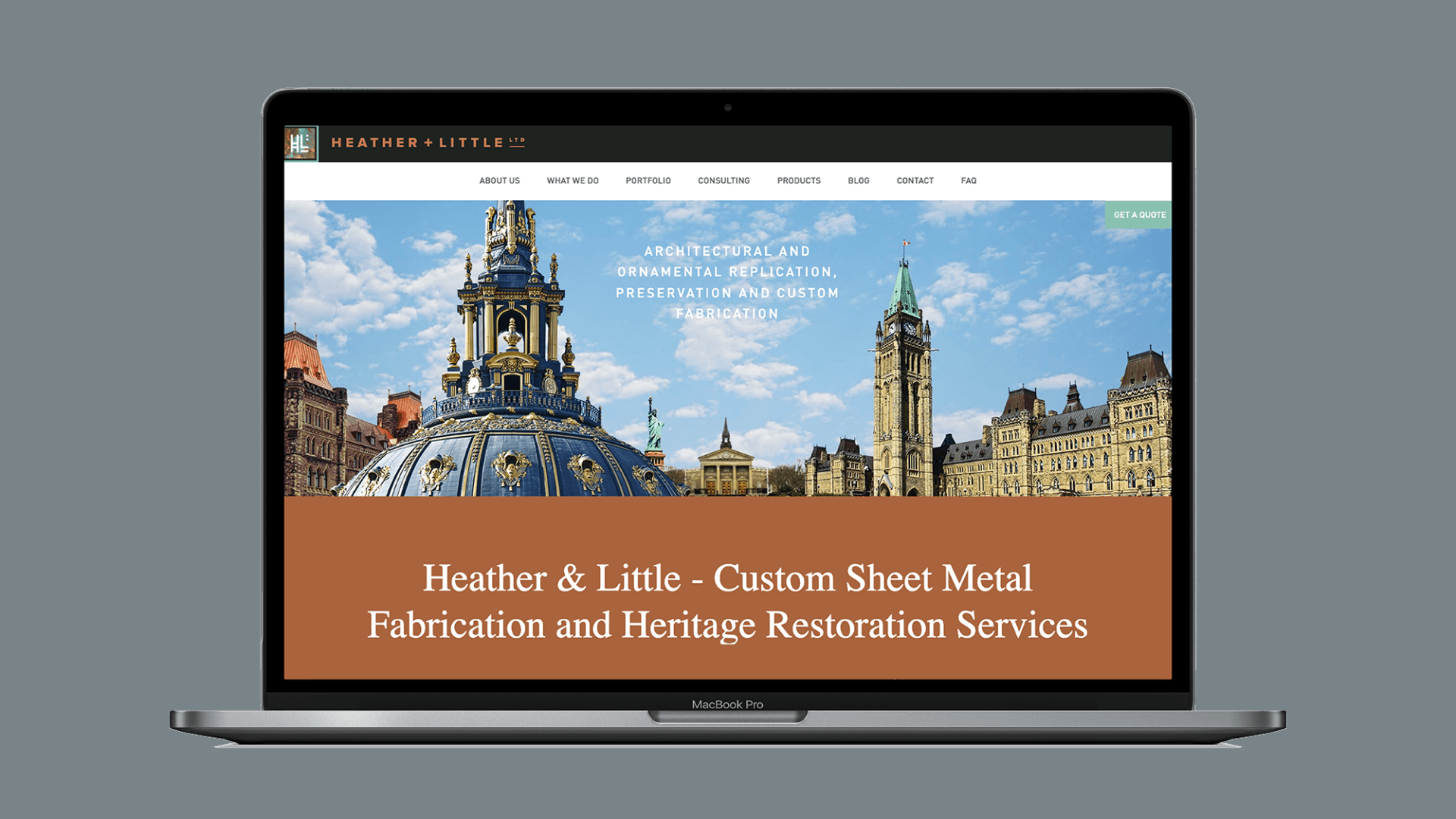
Heather and Little's website is clealy part of a cohesive, and elegant visual brand. We designed and developed the Heather and Little website. The first iteration reinforced the company as a premier fabricator of custom ornamental sheet metal and historic sheet metal restoration throughout North America. The second website, which is live today, fine tuned the user interface to better speak H&L's clientelle and reorganized the product offereings. The site was buit to optimize SEO, optimized all imagry -- important for a image dense website. This website comprised a large amount of detail and images, and required painstaking research , writing and organization skills from our Overdrive writer.
Below: the home page banner features a imagined streetscape filled with Heather & Little’s work.

Overdrive Design Limited: Creative, Art Direction, Design and Development
Flash Reproductions: Printer
Its always gratifying to be asked to come back and evolve a website you've previously worked on. Typically a site needs a revamp after two to three years, however Heather and Little confidently used their Overdrive designed and built website for over five years. When the time came, we worked together with Heather and Little to find their pain points, streamline their user experience and showcase new business goals such as their consulting service. We love working with Heather and Little – for their collaborative nature and their commitment to doing the very best work.


