Boulderz Climbing Centre
Built for the Climb Website Design and Visual Identity for an Indoor Climbing Gym
Project Snapshot
Client
: Boulderz Climbing CenterIndustry
: Clubs, Recreation & Community OrganizationsServices
: Brand Expression · Photography · Icons · Website Design and DevelopmentChallenge
: Design a website that could do the work of brand standards, establishing a visual language that captured the energy of indoor climbing while making the experience feel welcoming to a broader community.Outcome
: A bold, flexible visual system anchored in the website, with a visual language that could extend to wall graphics, signage, apparel, digital touchpoints and everyday gym communications.
Overdrive partnered with Boulderz Climbing Centre to reimagine their digital home—one that could match the spirit, scale, and soul of the walls their community climbs every day. This wasn’t just a website redesign—it was a re-grounding of who Boulderz is and what they stand for. We wanted the experience to feel like that first confident reach on a new route: clear, welcoming, and full of possibility. With every click and scroll, the site needed to reflect the rhythm of Boulderz—its deep roots in community, its support for lifelong climbers, and its belief that climbing is for every body.
The new Boulderz site is equal parts functional and emotional—a tool for growth and a mirror of the inclusive energy that defines the gym. It’s about trust, belonging, and that quiet surge of confidence when you finally top out.
Capturing the Climb Differently
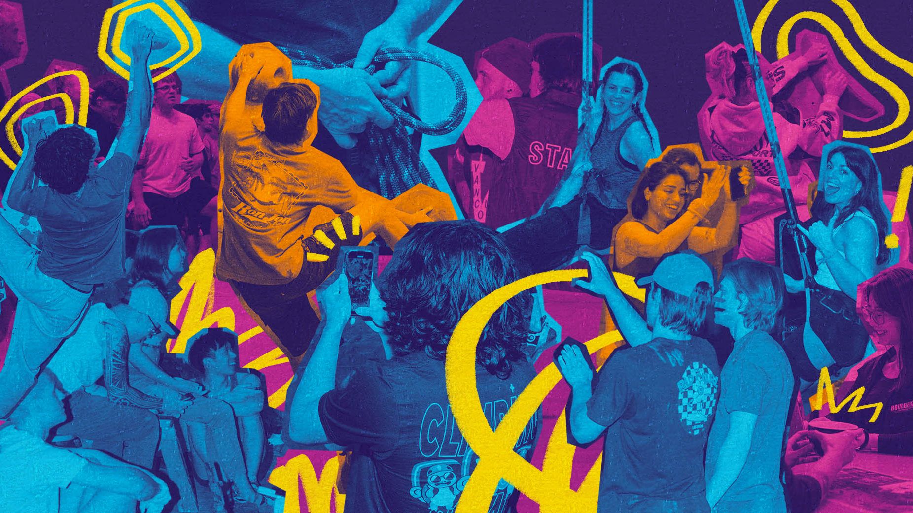
As part of the redesign, Overdrive took on the photography direction to ensure the visuals matched the energy, grit, and personality of the Boulderz community. We didn’t want stock images or clean, commercial gloss—we wanted texture, intimacy, and presence. So we hit the walls ourselves, cameras in hand.
We leaned into flash-style photography and fisheye lens work, embracing distortion and drama to get close—really close—to the movement. The result? A visual language that feels embedded in the action. Chalk in the air. Faces mid-effort. Dynamic angles that pull you in instead of just showing you what's happening.


Tape & Terrain
Colour Palette & Gradient Map
The Boulderz colour system is intentionally vibrant, high-contrast, and playful—reflecting the energetic, community-driven spirit of the gym. Each gym location is paired with a unique signature colour, helping climbers easily connect content and events to their home base. These individual tones come together through dynamic gradient maps, creating movement and cohesion across the site. Used in backgrounds and transitions, the gradients keep the experience visually active and full of personality.
Tape Treatments
Inspired by the physical gym environment—especially the hold-labeling tape found on real climbing walls—the tape motif adds an authentic, tactile layer to the digital interface. It brings a sense of groundedness and personality while also functioning as a visual separator or call-to-action highlight throughout the site. These treatments help connect the website to the physical space, evoking a DIY, lived-in, and community-built vibe.


The Website Redesign
The Boulderz website redesign aimed to create a dynamic, welcoming, and community-driven experience that reflects the brand’s inclusive, energetic climbing environment. The objective was to humanize the gym’s identity while showcasing its offerings to both new and experienced climbers. Key goals included improving navigation, elevating the visual language to match Boulderz’s vibrant personality, and emphasizing unique features such as youth programs, training tools, and special events.
The site also needed to address practical concerns—streamlining first-time visitor onboarding, clearly presenting location-specific information, and integrating with tools like Rock Gym Pro. From design to development, the project sought to merge form with function: creating a bold, responsive site that inspires exploration, builds community, and makes it easy to take action.

First Visit Questionnaire
The First Visit Questionnaire is designed to streamline the Boulderz onboarding experience by guiding new visitors to the right information, programs, and procedures—based on their specific needs. Whether you're a first-time climber, a seasoned boulderer, or planning a group visit, this decision tree breaks down user pathways into clear, accessible profiles.
By asking just a few targeted questions (e.g. climbing experience, age, children, or group status), users are funneled into 10 distinct user profiles. Each profile leads to a tailored onboarding journey—ensuring that newcomers aren’t overwhelmed and can confidently understand what to expect, what they’ll need, and how to get started. This not only boosts clarity but also reflects Boulderz’s commitment to inclusive, user-centered community climbing.


Collateral
To bring Boulderz’s energetic identity into the physical and digital world, we developed a collateral system that’s bold, flexible, and unmistakably fun. Each event is treated like a mini celebration—anchored by expressive titles, dynamic climbing imagery, and a vibrant tape motif that echoes the design language of the website.
From posters in the gym to social media templates and mobile assets, the system ensures a consistent brand experience across all touchpoints, reinforcing Boulderz’s spirit of connection, energy, and movement.


Special Thanks
Matteo DeDios for his work on the logo.
"In the past our website was just part of our business. Since we relaunched the site with Overdrive Design, I’m proud to show it off, I’ll say to people "hey have you seen our website.” Thats a big deal for me."
— Andrew McBurney
"Thank you to the Overdrive team. They truly collaborated with us to understand what Boulderz is and searched for the best ways to express who we are and what we do best. We know climbing, they know design"
— Silvia McBurney


