Toronto Jewish Film Festival
PROJECT
Rebrand
A rebrand to celebrate a quarter century of Jewish film.
DESCRIPTION
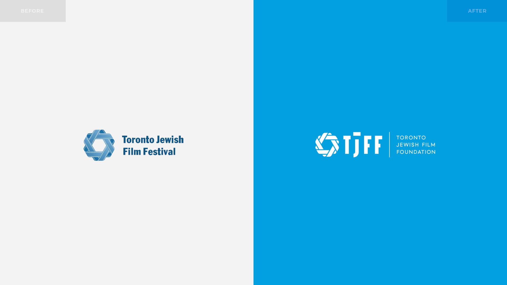
After Overdrive’s 17-year ongoing partnership with the Toronto Jewish Film Festival, it was time to say goodbye… to the old name. This was coinciding with its 25th anniversary in May 2017. The Film Festival has always been the marquee star of the TJFF Foundation. As a result, the Foundation became less visible and less understood as a brand in comparison to one of its main offerings. The end result being that TJFF felt it was a logical time to shift some of the focus back onto some of the ongoing work by the Foundation that takes place outside of Festival time.
After months of work, the result was a successful rebrand as The Toronto Jewish Film Foundation. The organization hopes to bring more profile to the Foundation as it continues its work in education, distribution and bringing Jewish film to a wider audience throughout the year.
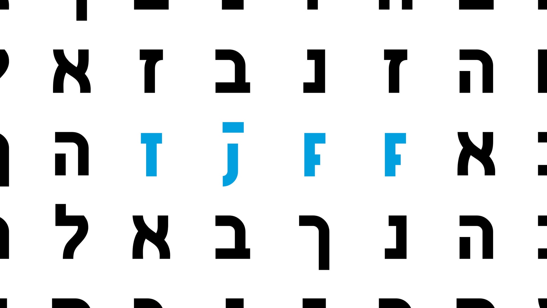
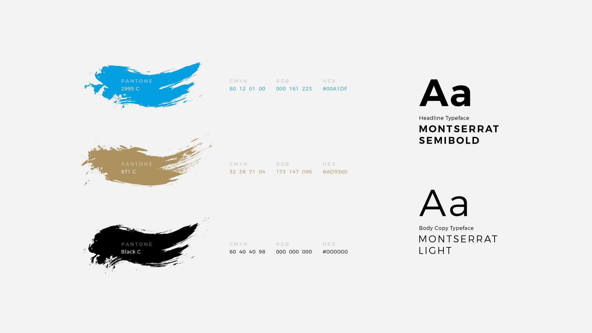
In order to accomplish this, Overdrive aimed to modernize the logo and visual identity, while retaining the brand equity established by the Festival. Fortunately, from a design and branding perspective, both the foundation and festival share the letter F and we were able to keep the acronym that has been used since the organization’s beginnings. We followed this with a brand expression that reflects the international diversity of Jewish film—a core commitment of the TJFF.
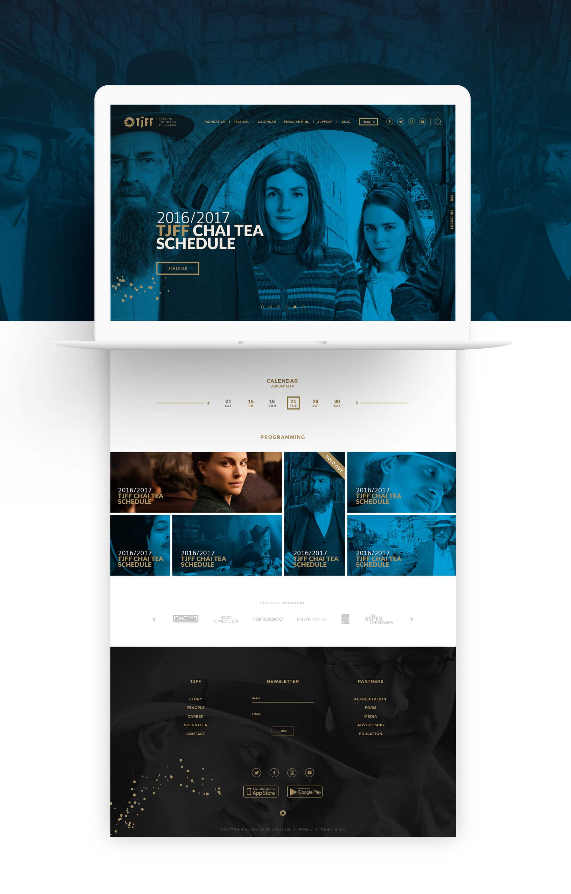
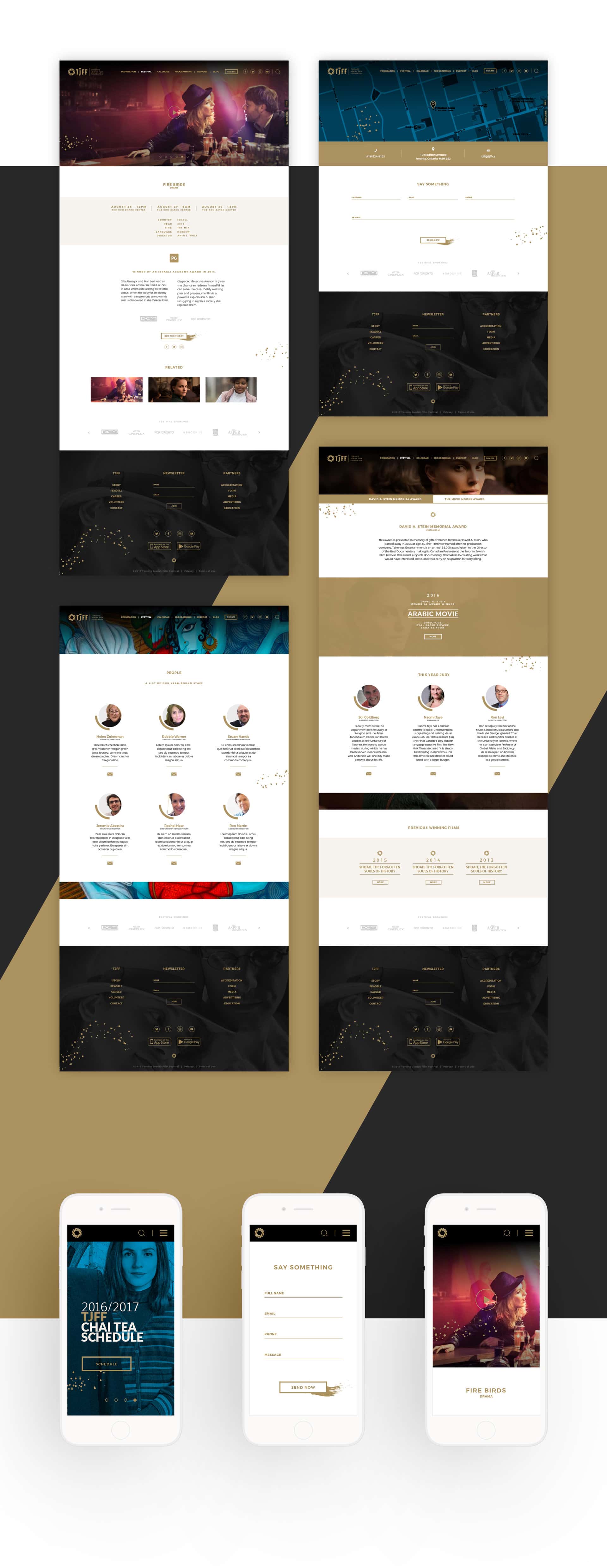
The project scope also included a fresh website with new web design and web development. This was the third that Overdrive has designed for the TJFF, the last re-design and build occurring in 2011. When a website ages gracefully for six years its fantastic, but nothing lasts forever in the online world. And so, it came time for us to redesign the website in order to facilitate greater awareness of the Foundation’s work as well as to address current accessibility standards.
DELIVERABLES
Rebrand, Visual Identity, Brand Expression, Stationery Package, Website Design and Development
CREDITS
Overdrive Design Limited—Creative, Art Direction, Design, and Development
LINKS
Visit the Toronto Jewish Film Festival website: tjff.com