ROM Gallery of Modern Design
A new way to experience the ROM’s collection of 20th century furniture, glassware, ceramics, silver and other metalwork.
Deliverables
- User Interface Design
- User Experience Design
- User Interface Standards
- Fully Annotated Files
- Development
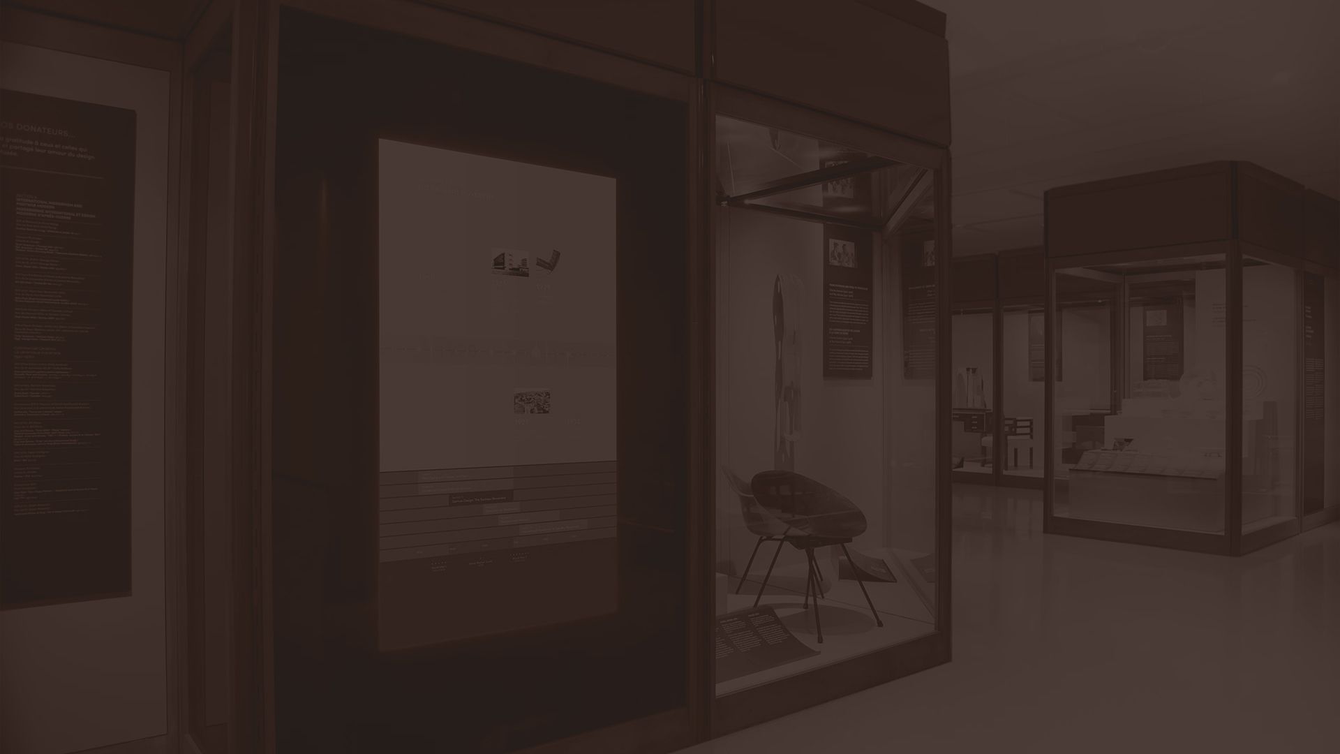
Capping off over a decade of interactive work at the ROM, Overdrive was commissioned to design the UI for information in the Gallery of Modern Furniture. Taking cues from minimalist Bauhaus design and many of the pieces in the gallery, Overdrive created 2 80″ touch installation walls that seamlessly blend into the gallery surroundings. They provide both information on gallery specifics, as well as a historical-temporal overview of the modernist period stretching the decades. The user experience was created with the goal of having the interface fade away, or merely have a subtle presence when not in use, and only become more focal when engaged. The UI was originally designed in multiple colours, but was determined to feel too contemporary and ultimately changed to a monochrome look.
→ Visit rom.on.ca
Multi-touch Interactive
The Royal Ontario Museum preserves extraordinary examples of 20th century furniture, glassware and ceramics, silver, jewellery, as well as graphic art by internationally acclaimed designers. The broad and varied collection encapsulates major movements of 20th-century decorative art and design, including Art and Crafts, the Weiner Werkstätte, the Deutscher Werkbund, French Art Deco, American Modernism, the Bauhaus, and Post-War International Style.
Based on it’s long history with the ROM and interactive initiatives, Overdrive was commissioned to design and program a large format multi-touch presentation that would not only provide deeper information on the objects themselves but more importantly illustrate the inter-relationships between objects, movements and designers.


Final User Interface
The gallery’s physical labelling was being designed by the ROM exhibit team at the same time as Overdrive was designing interactive. Ultimately it was the extension of colour and type standards used in hard labelling that informed our final design.


