RBC Global Asset Management

Investing in an Updated Visual Identity and iShares 2023 Invest for What’s Next Campaign
Project Snapshot
Client
: Royal Bank of CanadaIndustry
: Insurance, Finance & Regulated ServicesServices
: Brand Standards · Visual Identity Refresh · Layout System · Photography Guidelines · Chart & Table Design · Campaign Ideation · Illustration · Animation · CopywritingChallenge
: Refresh RBC GAM’s visual identity to better reflect its global stature in investment management, while keeping the RBC master brand central and creating standards that internal teams and external partners could apply consistently.Outcome
: A comprehensive brand standards system covering logo use, colour, typography, layout, photography, charts and tables, later extended through the 2023 iShares “Invest for What’s Next” digital campaign.
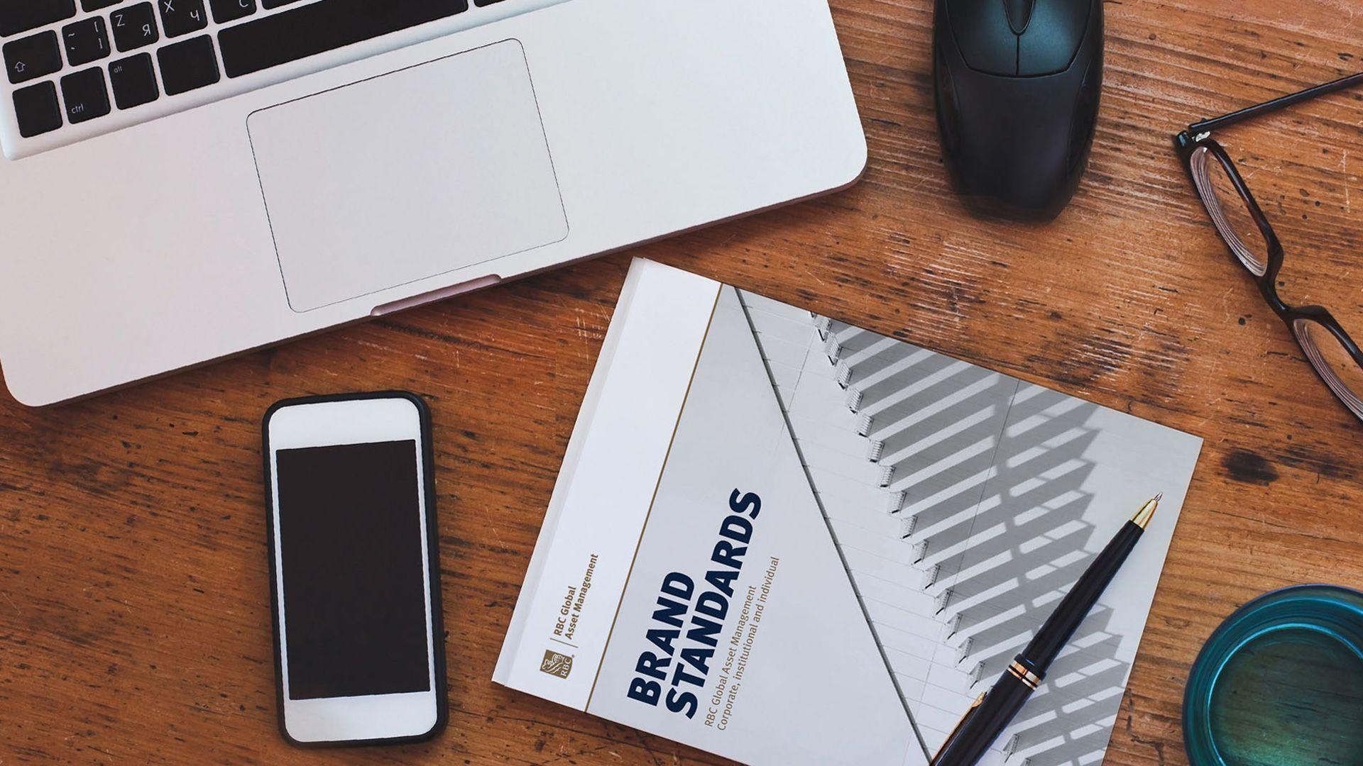
Overdrive was commissioned in 2015 to update the RBC GAM visual identity, to better reflect GAM’s global stature in the investment arena. The project consisted of a full revision of RBC GAM’s printed and screen materials, revisiting the palette, typography, photography, layout of print materials, charts, tables, and other miscellaneous items. It was an enormous undertaking. Our challenge was to create a comprehensive brand standards manual that could be used internally at RBC GAM as well as by their contractors that would speak to GAM’s design wish-list.
The GAM in-house team was looking for a very contemporary, open and visually engaging solution, but knew they needed to keep the RBC brand primary palette central to the application. We were able to resolve these needs through a refreshed blue and gold palette, bigger and bolder typefaces to reinforce the sense of leadership, beautiful open images that feature a more editorial and conceptual approach, and more white space in layouts.
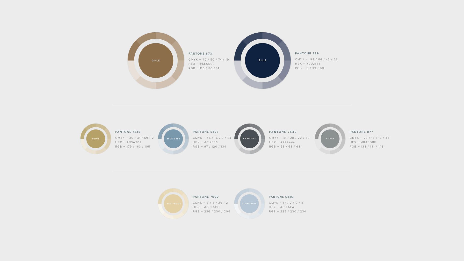
Palette
While the primary colours were inherited from the previous brand standards, the secondary and tertiary palettes were revisited to better match the primary colours. As the standards were developed, the secondary palette became more important as it set the tone for photography, background, and iconography in charts.

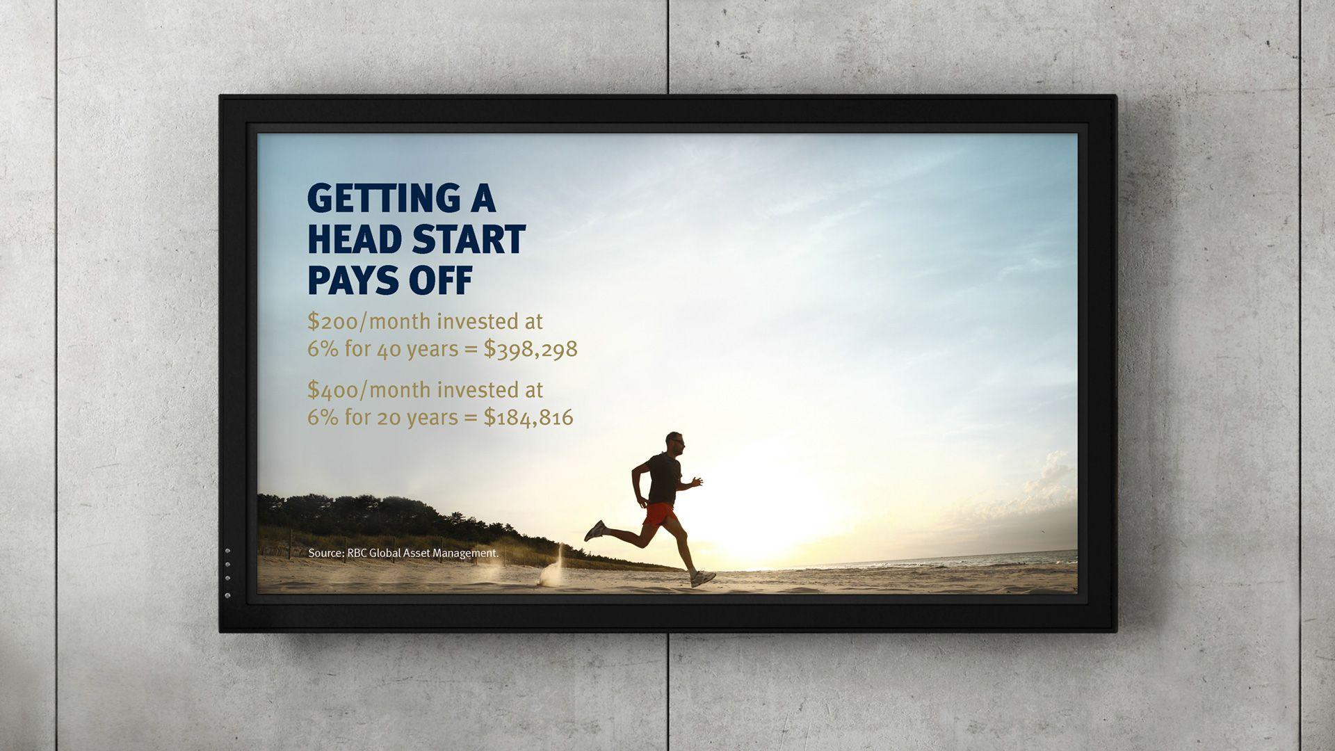
Photographic Treatment
Images in the new compositions were meant to be used large, and usually contain at least 35–50% white space to allow for text. These images will be open, full of natural light and optimistic; they will also have heavy blue and gold/beige overall look, as long as they appear fresh, authentic and natural.
2023 iShares Invest for What’s Next Digital Campaign
RBC GAM commissioned Overdrive to ideate and execute a campaign for Fall Winter‘s “Invest For What’s Next “. We needed to find a theme for these 15 second spots that would work with Blackrock-oriented iconography. Each spot needed to work at a variety of sizes, and needed to feature a specific investment product: Core, Dividend or Fixed Income. There was also a spot that focused on Brand.
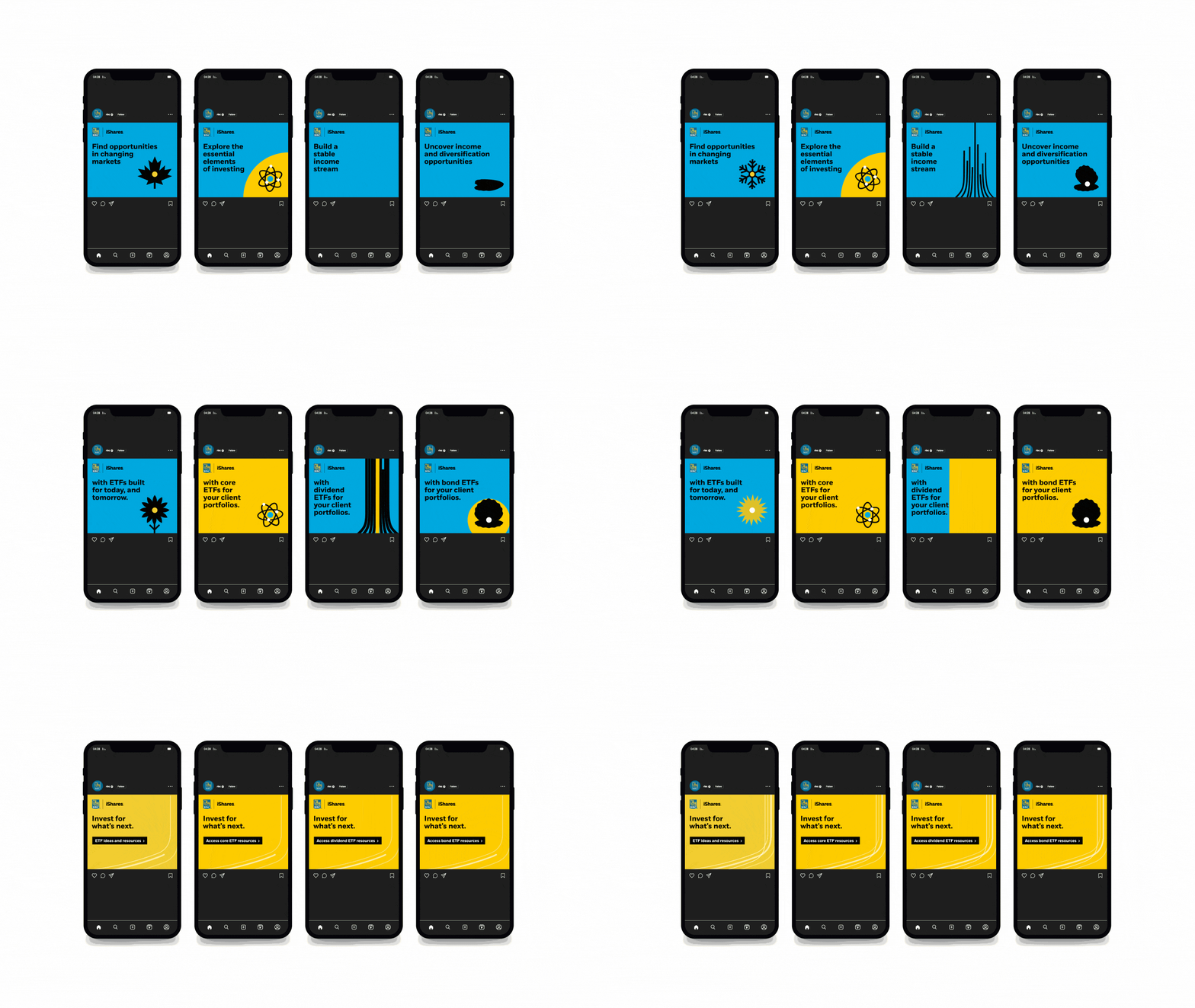
15 second Animations in five different formats


