Orion Travel Insurance
Protecting travellers and their loved ones –wherever their travels may take them.
Deliverables
- Visual Identity
- Logo
- Brand Expression
- Collateral Design
- Packaging Design
- Web Design
- Icons and Illustrations
- Brand Standards
Orion Travel Insurance is powered by the well known CAA Club Group.
Orion strives to protect Canadian travellers globally and to be proudly recommended as the most trusted travel insurance company in Canada – all with that CAA caliber assistance.
Overdrive began this rebrand project with a logo and brand expression exercise after working on sister company CAA Insurance Company. Eventually the project would balloon and grow into a full visual identity with the creation of a large variety of collateral materials, a full library of chubby icons, a brand standards document, packaging design, animated holiday cards, and centrepiece custom illustrations designed in a twist on vintage travel posters.
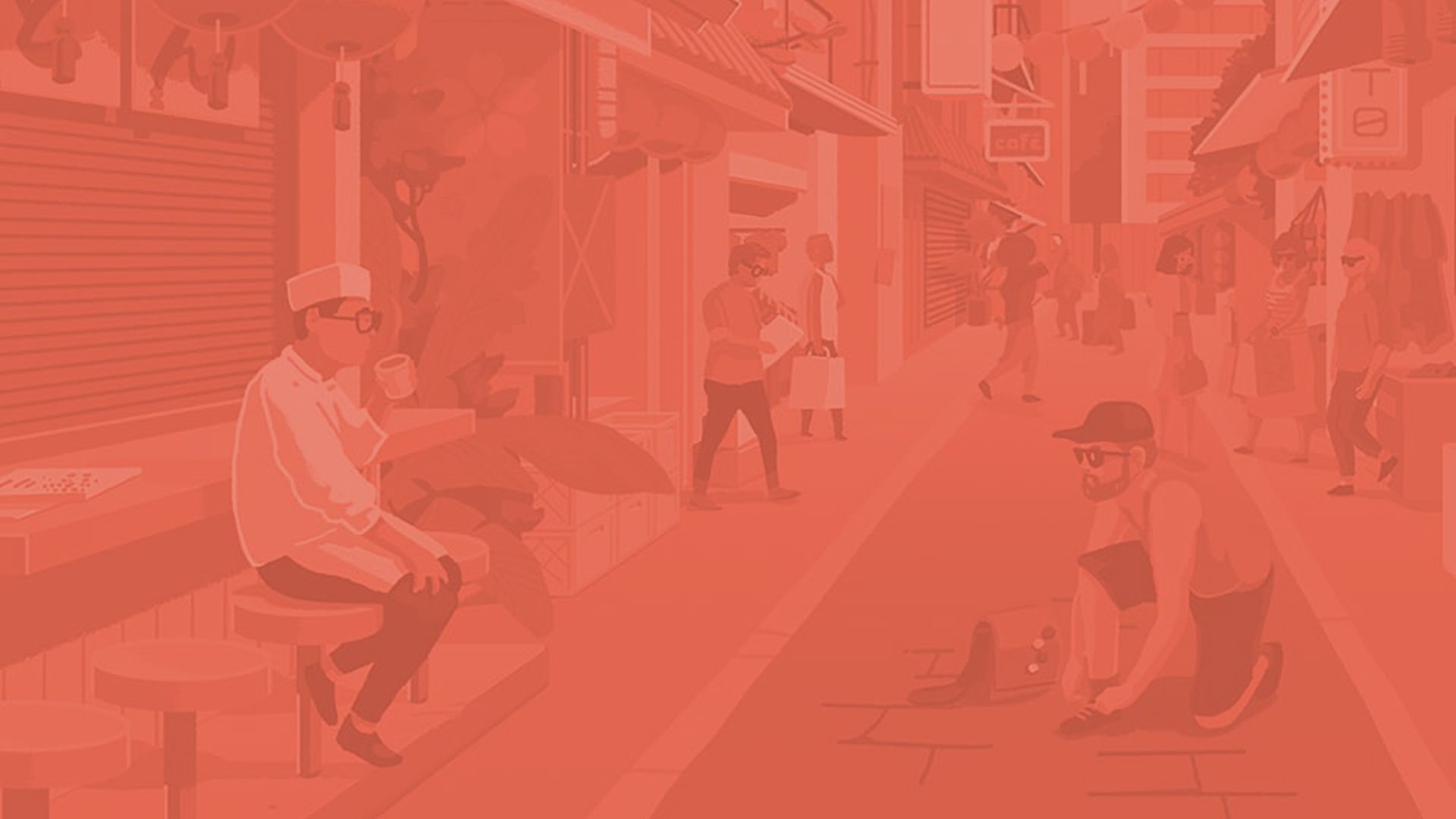
Insurance can often be a homogenous design scene. As such, in the way that brand’s want to own their look, we aimed to create a striking and unusual colour pallet that ran contrary to what insurance companies might ordinarily be associated with. The colour pallet was also used in illustrations to create “blue people” rather than people of any specific ethnicity, thus rendering all people simply travellers. We also applied a specific colour filter to all photographs to give everything an instagram account like appearance and consistency.
All elements considered together, the rebrand was created to be encouraging, friendly, and reassuring, with a hint of excitement and wonder. The brand’s tagline “You take on the world, we’ll take care of the rest.” further reflects this idea.


