Metro Compactor Services
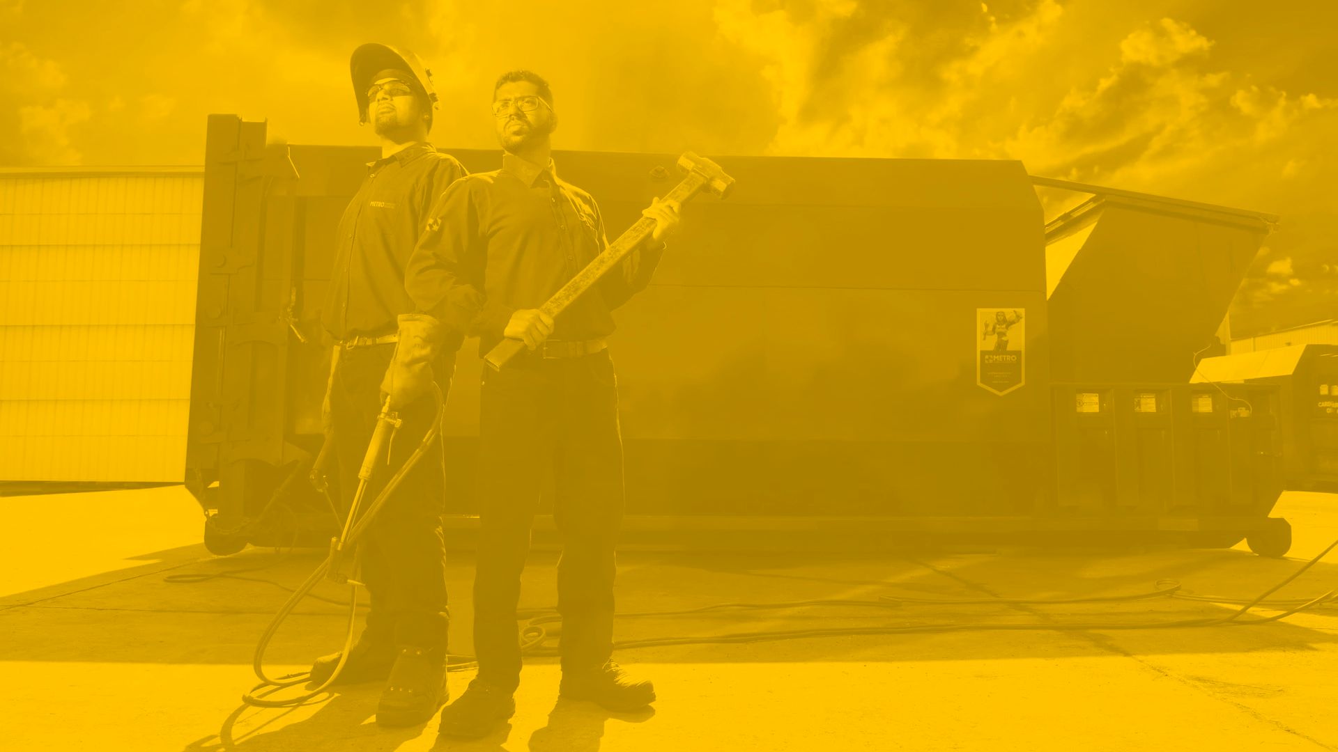
Making Garbage Look Good Industrial Service Branding and Character Design for Metro Compactor
Project Snapshot
Client
: Metro CompactorIndustry
: Built Environment, Trades & Industrial BrandsServices
: Comprehensive Rebrand including Creative Direction, Naming, Tagline · Visual identity · Web design and development · Brand standards · Collateral · Illustration · Tradeshow booth.Challenge
: Refresh Metro Compactor’s visual identity and make an unglamorous industrial service category feel more human, responsive and memorable — expressing the company’s ethos of solving problems before customers even knew there was a problem.Outcome
: A refreshed identity system — including logo refinement, colour palette and typography — paired with a character-led campaign expression that gave Metro’s service promise more warmth, wit and personality.
Overdrive refreshed Metro Compactor’s foundational identity system, refining the logo, colour palette and typography to give the brand a cleaner and more cohesive visual presence.
From that foundation, we developed Gale, the Super Service Superhero — a character-led campaign expression designed to humanize Metro’s service promise and put a little shine on an unglamorous category. The choice of a female service technician was specifically chosen as a nod to the company’s progressive corporate policies while the fairy wings were added to convey a lighter aspect of the company’s personality. Photography was likewise shot in a very tongue-in-cheek manner using low angles to create an exaggerated monumental tone.
Metro’s current marketing materials have since evolved under later direction, while core elements of the visual identity refresh continue to carry forward.


