Visual Focus: The Superspeaker
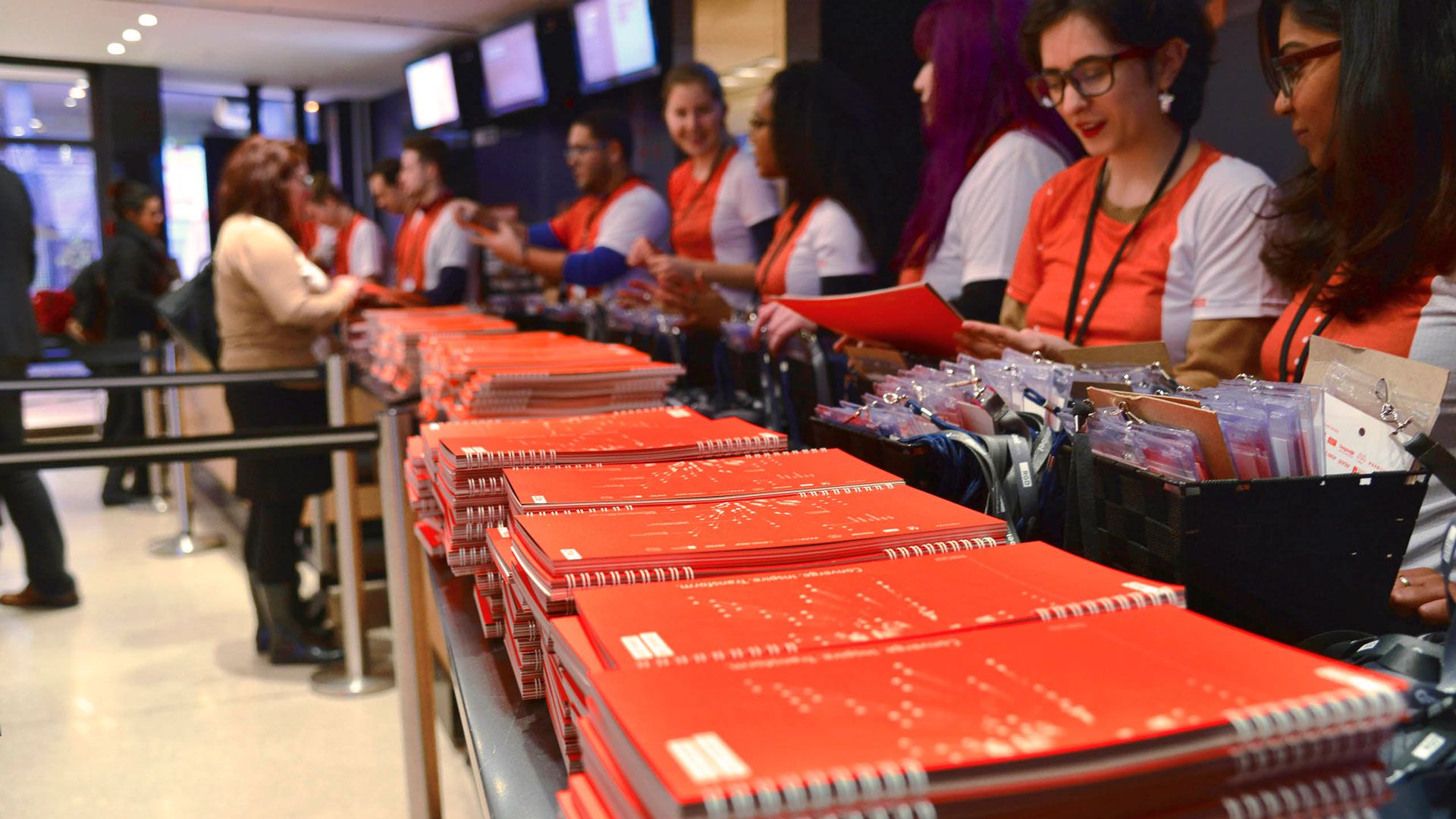
Deliverables
- Branding
- Visual Identity
- Collateral
- Program
- Brochure
- Videos
- Website
- Acrylic Sculpture
- Wayfinding and Signage
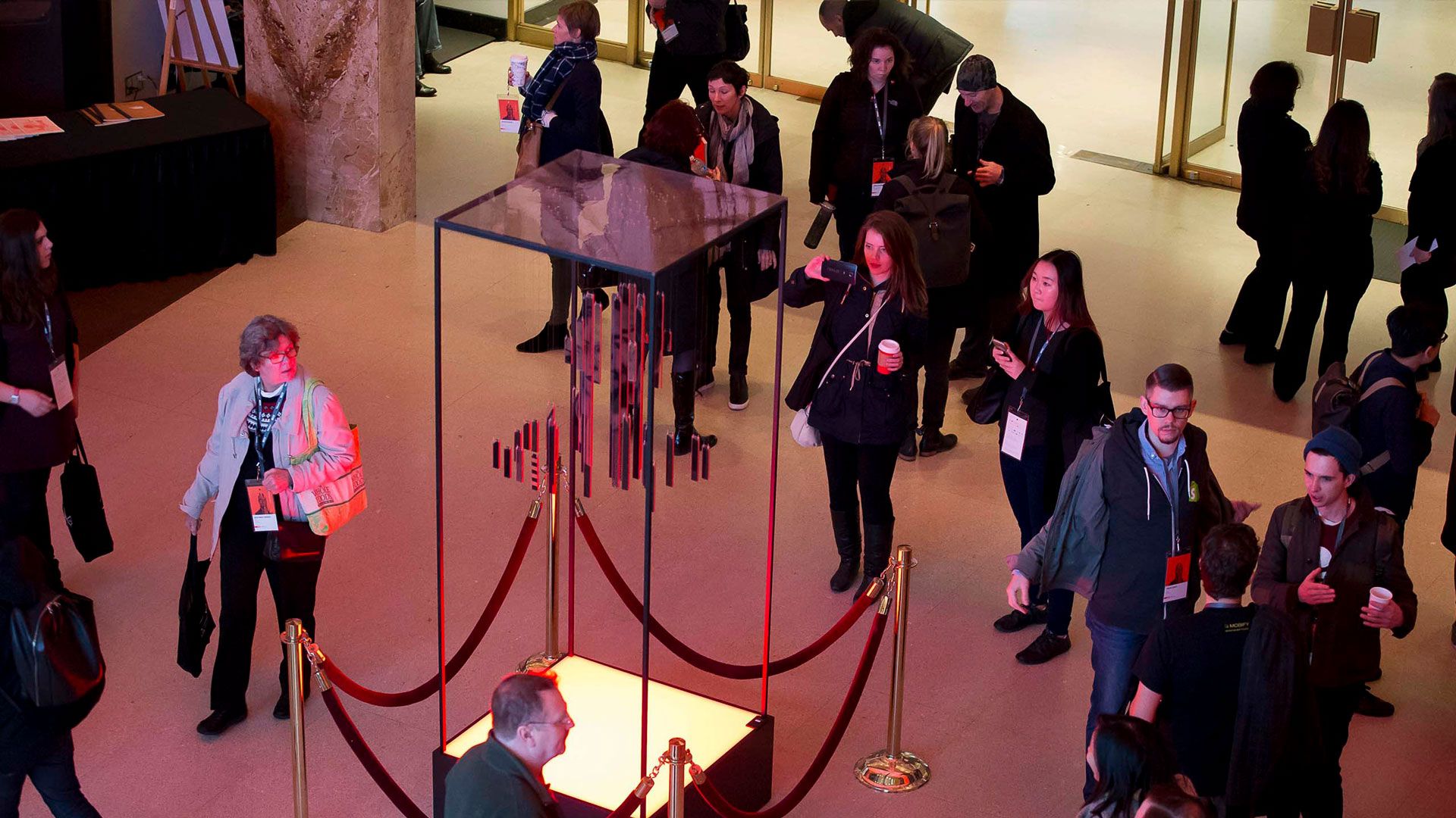
From the beginning, we envisioned that a piece of three dimensional work would become the visual centrepiece of the campaign. In the end, it took the form of a piece of sculpture, assembled inside of a custom-fabricated 8 foot high metal framework. The sculpture itself was digitally printed on 44 pieces of 3/8” acrylic (not 43 or 45) . Each piece was then hand drilled, epoxied and fastened to fishing line via miniature hardware.
At the time that we began to design this piece, we had no idea how many speakers would be attending the conference or who they might be. No names, no data, no information, no nothing. The sculpture needed to be abstract, but at the same time it needed to be representational. In the absence of speakers images, we creating assets by photographing members of the studio and our friends to act as stand-ins for the real thing.
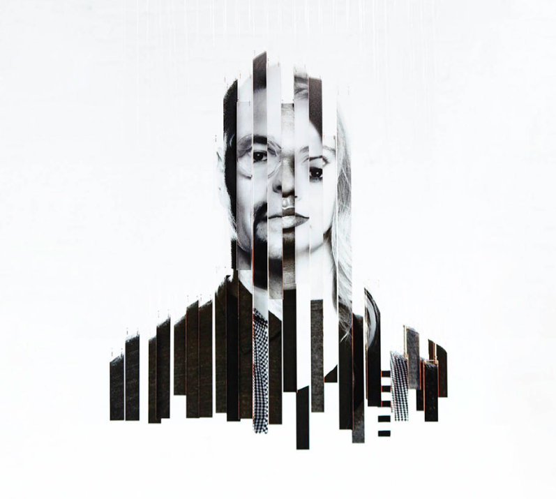
After slicing and dicing, we were able to display a recognizable human face and from the side, the profile of a human head and shoulders. By viewing the sculpture at angles other than straight on, the form dissolves into something abstract, resembling bits of data or bar charts or pixels.
From its conception to finished product, the sculpture took the studio team more than 9 months to complete but with full knowledge that it would be used in many different ways. For instance we knew that we would use the image of the sculpture as a visual element in many of the conference collateral materials., not to mention using it as a centrepiece at the conference to make a final connection with the marketing materials that people had seen leading up to the conference.

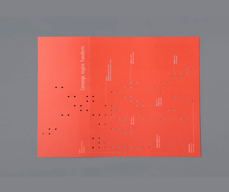
The first printed piece we tackled was a postcard but at that point in time, the branding was in development and the sculpture was in progress so we had less than nothing for imagery. What we did have however was a concept, a bit of data about the conference and while we hadn’t finished the sculpture, it had been completely planned on paper and involved “hanging points” on a particular grid. This formed a pattern which can be seen in many of the collateral materials for the conference. Printing the podtcard proved to be a challenge; the diecut portion of the card did not cleanly disengage from the stock. With a mail date looming, and reprinting not an option, we cooerced friends, family, and stray passers-by to manually extract the the diecut dots that hadn’t released with toothpicks. 4 days x 6 people x 10,000 postcards = 960,000 pieces of confetti . Committment or crazy. we got the job done,
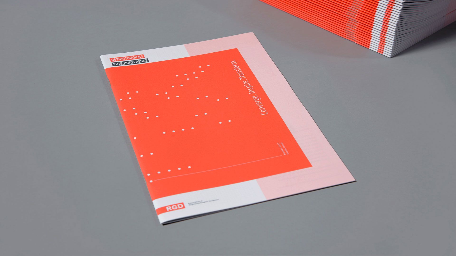
Pre Conference Brochure- Above Left
Although not the largest of projects, this brochure proved to be one of the most difficult pieces to complete in terms of revisions and sheer hours. New speakers were constantly being announced or rescheduled and additional events were added right up to the last minute. In addition to all the moving pieces, the finished brochure could weigh no more than 60 grams to meet mailing requirements.
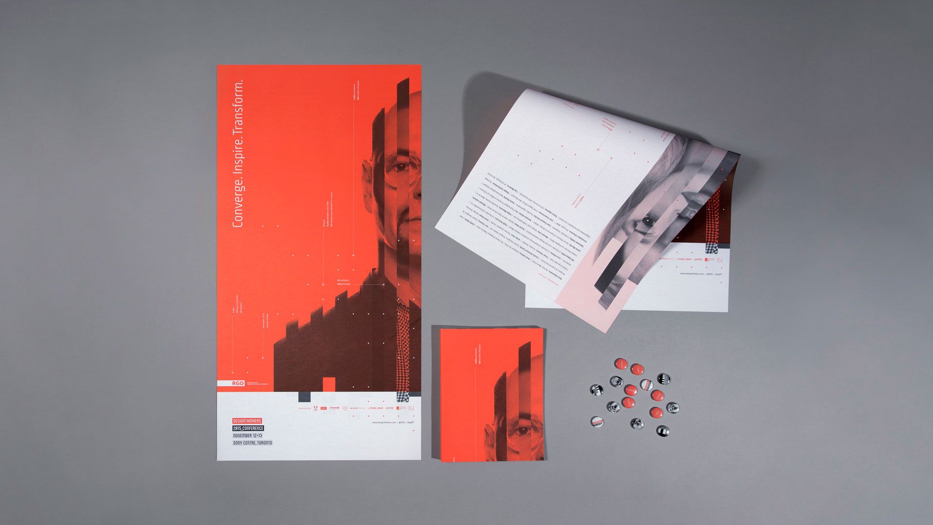
Poster - Above right
Successful posters need to be both legible and understandable at different distances. The first vantage point is… at a distance. In order to accomplish this we used photography and a big hit of colour to make the image recognizable. The poster was a turning point in project as we were finally able to use the SuperSpeaker in the way that it was intended - as the hero of the visual identity. When the front and back of the poster are put together side by side, they form the SuperSpeaker image in its entirety defined by the grid used to build the sculpture.

Conference Program
By the time we reached the design of the program, we fully understood the visual language for this project. We’d built and photographed the sculpture, had worked out grids palette and type for other materials. In terms of content, the speakers and schedule were finally locked down. We were ready to pull it all together.
Chapter openers and photography were used to separate the sections of the book and to organize the content. Speakers were given their own pages and keynotes given spreads, allowing for their photography to be used in a substantial way and for their stories to be given the focus they deserved.
One of the joys of print projects is leveraging amazing stock, and the Design Thinkers Program provided a fantastic opportunity. Different types of papers and paper finishes were used to help organize and separate content, and to reinforce an aspect of hand crafting.
Event Display and Wayfinding
A literal plethora of signage, digital screens, wayfinding, event lighting, banners, door and pillar wraps, backdrops, easels, podium wraps, and lightboxes all required design attention. Together all these elements came together to create a cohesive event environment. And of course, at its centre was the Super Speaker Sculpture, which we were gratified to see was used as a photo op, meeting place, and social medial anchor.


Credits
Somerset Graphics: Print Partner
Mohawk: Paper Partner
The Pixel Shop: Digital Partner
Resource Integrated: Signage Partner
Russell Wu: Lead editor, video footage
Christian Castel RGD at Tango Media: Lead animator, editor.
Bruce Fleming, Mach Sound Studios: Sound editor.
Brian Pieters:
Still photography, video footage and loaners of really expensive cameras, lenses and lights.
Camera Assistant: Thomas Lee.
Marc Alcide: still photography and behind the scenes. McWood Studios: Sculpture fabrication and unfettered access to their fully equipped wood shop.
Plas-Tech Inc: Acrylic image printing.
Awards
2017 Graphis Design Annual - Silver Award in Print/Branding
2017 Graphis Design Annual - Silver Award in Video/Branding
2016 Summit International Creative Awards - Gold
2016 Creativity International Print & Packaging Design Awards - Gold
2016 Applied Arts Design Awards - Complete Design Program
2016 Redgees Awards (Toronto) - Campaign / Honourable Mention
Special thanks to the RGD for giving us the opportunity to be the Design Partner for the conference.
When you sign up for something like Design Thinkers you think you know what you are in for. But you really don’t. It was a huge pro-bono endeavour, but our team was committed, so we thought, let’s dig in and get ‘er done. The scope was both terrifying and exciting. As designers we are always looking for new challenges, and this was certainly that. Seeing all the planning and hard work come to fruition – and recieve a positive response from attendees was gratifying. Were there moments when we thought "well, we won’t do that again"? Maybe. But when we look back on what we achieved, what we learned, the experience was well worth it.


