Cherry Birch General
Cherry Birch, Beautifully Wrapped Modular Packaging Design for a House Brand of Little Luxuries
Project Snapshot
Client
: Cherry Birch GeneralIndustry
: Hospitality, Lifestyle & Consumer BrandsServices
: Packaging Design · House Brand Development · Illustration · Label System · Product NamingChallenge
: Develop a house brand and modular packaging direction for Cherry Birch General that could coexist with the shop’s curated mix of specialty goods while supporting candles, soaps, bath products, pantry items and seasonal launchesOutcome
: An illustration-forward packaging system built around a reusable Cherry Birch visual mnemonic, restrained typography and modular scent labels, giving the product line a recognizable retail presence while keeping production practical, scalable and adaptable
For Cherry Birch General, Overdrive explored how a distinctive Hamilton shop could begin building its own house brand — one flexible enough for candles, soaps, bath products, pantry items and seasonal launches, while still feeling rooted in the store’s curated, artisanal character.
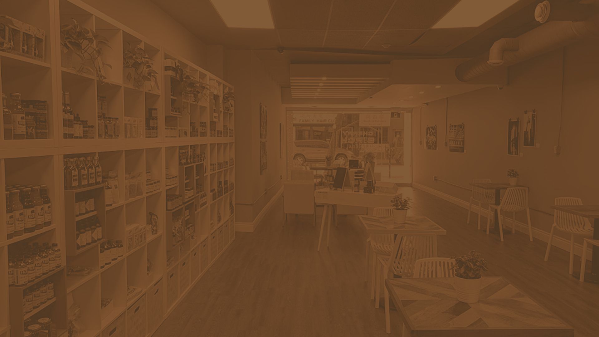
Cherry Birch General is a beloved Hamilton, Ontario hybrid café, bakery, and general store known for its thoughtfully curated collection of all-Canadian specialty goods. When the owner decided to launch an in-house line of small-batch gourmet foods and artisan candles, she needed a brand strategy and packaging system equal to the shop’s standards. Our challenge was to translate years of local trust and owner-led curation into products that felt unmistakably Cherry Birch. To do this, we developed a modular labelling system that was cost-effective, scalable, and flexible across product categories. Because the proprietor was already seen as a trusted local curator, the new in-house product line could build naturally on existing brand equity rather than start from scratch.

Initial Concepts and Inspiration
The project began by exploring how Cherry Birch General could begin building a house brand that could coexist alongside the wide range of other products that made the Hamilton shop distinctive. Visual inspiration came from nature, William Morris patterns, apothecary labels, modern illustration and from some of the Canadian specialty goods carried at the store. The challenge was to create a modular packaging design direction that felt artisanal but not “crafty”, clean but not generic, and flexible enough to support candles, hand soaps, bath products, pantry items, and seasonal product launches.

Concept 1
A quirky custom-illustration approach that turns birch bark into playful creatures, giving the product line handmade character, shelf impact, and a distinctive visual language without relying on familiar small-batch packaging clichés.

Concept 2
This approach was aimed at the challenge of expansion: one consistent packaging architecture that could support many products and scents, while small colour-coded labels handled seasonal variation, scent personality, and cost-effective production.

Concept 3
Inspired by William Morris patterns this approach was intended to give immediate credibility, beauty, and gift appeal by drawing on a familiar decorative language associated with craft, heritage and home.

Concept 4
Also inspired by Morris patterns, the approach focused directly on the concept of a Cherry Birch to make it ownable and memorable.

Birch Concept Evolution
We established the Cherry Birch tree as a visual mnemonic, but the owner preferred less colour and one reusable illustration for the full product line. We explored a range of custom illustration styles, from highly graphic to highly naturalistic.

Final Packaging
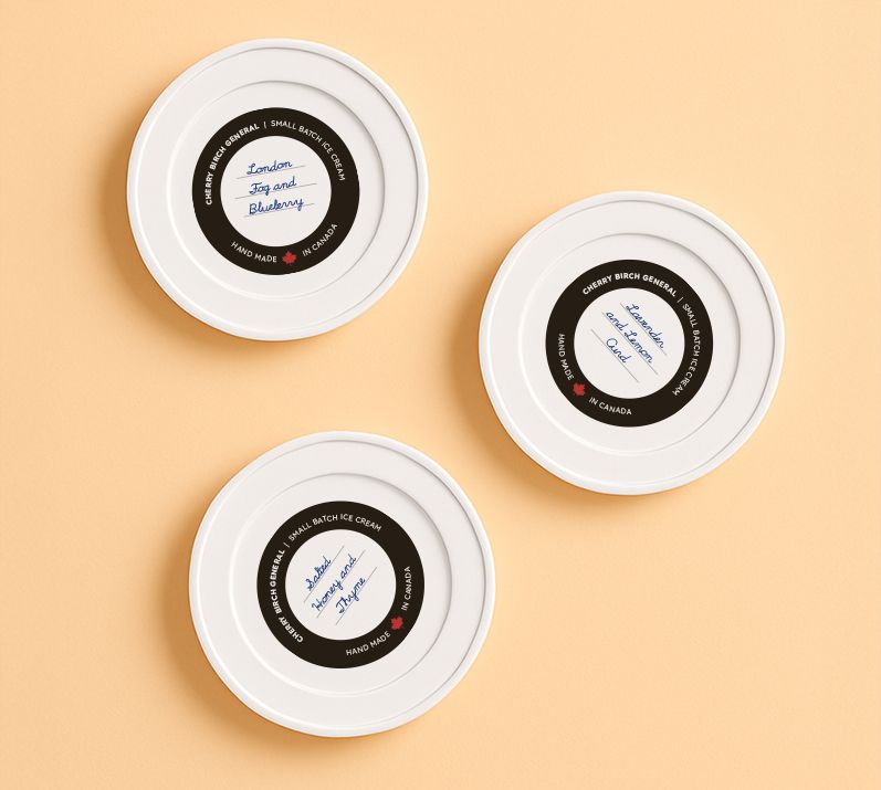
The final packaging system is illustration forward employing restrained typography. The packaging system consists of a single approach for the base label and modular scent labels to create a highly consistent identity across the full Cherry Birch product range. The scent names were developed to be lightly playful, conversational, and emotionally specific. This approach gives the product line a recognizable retail presence while keeping production costs low yet scalable, and adaptable for future product additions.




Credits
Overdrive Design Ltd.: Creative, concepts and design
Printing: Pryntco Hamilton
“Overdrive took the time to understand the heart of my brand, the realities of a small business, and the need for packaging that was both beautiful and practical. James brought strong strategic thinking, creative direction and a clear understanding of how design needs to work in the real world.”
— Lisa Behrend


