Harmony in Design: From Standards to Illustration
Deliverables
- Brand Standards
- Illustration
- Visual Identity
- Animation
- Digital Advertising Campaign
CAA South Central Ontario (CAA SCO) is Canada’s largest not-for-profit automobile association and one of Canada’s most trusted brands. We’ve been working continuously with them since 2018. In 2019 Overdrive was tasked with implementing a brand refresh, to modernize and finesse the CAASCO identity.
While the central assets (CAA logo, colours and font) were sacrosanct, almost every other aspect of the visual identity received scrutiny and exploration in a robust brand expression exercise.
Following brand expression, we established design rules and standards, and compiled them into a Brand Playbook, making sure the standards were an understandable and replicable resource for internal teams, external partners, and stakeholders,. The Playbook empowered them to effectively communicate and represent the CAA SCO brand in a visually coherent manner. Moreover, the Brand Playbook ensures CAA SCO will maintain a consistent visual identity that aligns with the organization’s core values and lines of business, enhances brand recognition, and foster a cohesive brand experience for years to come.
The Playbook includes guidelines and standards for the usage of logos, colours, typography, imagery, illustrations, animations, and other visual elements across various communication channels.
Re-design
A sampling of collateral elements Overdrive re-designed, including: website, business cards, poster, brochures.


Above: The All Roads pattern. We designed this to be an equity building tool in the CAA SCO toolkit. We developed four versions of the pattern: colour, primary line work, secondary line work and LOB. The All Roads Pattern symbolizes: many roads, community, activity, and optimism. The oval segments in the pattern are made to the exact proportions of the CAA oval. The concept behind the pattern is that it creates shapes reminiscent of nature, stars and maps. Throughout the brand expression process we discovered many applications for the All Roads pattern.
Below: Like the All Roads Pattern, the origin of the Smidge is the CAA oval. We designed the Smidge to be an active shape that can be used to create energy through movement and direction. It is more than just an arc as it can be used as a standalone graphic or as a container for imagery.

Brand Playbook
The ultimate reference: the Brand Playbook, a foundational tool for maintaining consistency, clarity, and integrity in all brand communications. We consolidated our learnings from brand expression and new collateral into a comprehensive document that internal and external designers and managers could collectively refer to, enabling them to effectively communicate and represent the brand in a unified manner.
Building an Icon Library
Icons allows for the communication of complex ideas and concepts in a concise and visually appealing manner. However these icons work even harder, as they are all custom designed and specific to CAA SCO and reinforce the visual brand identity.
The icons empower CAA SCO’s internal design team to create compelling visual experiences using simple building blocks. The loose design of the icons with offset colour brings a professional playfulness to the visual language. The icon library continues to grow and evolve, and new uses continue to be found, including building different scenes and scenarios from combinations of icons. Icons were developed in sets comprised of four different sizes, with varying degrees of detail and colour fill to accommodate different uses from print to display ads.
Icon Scenes
CAASCO understands the value of leveraging design assets and icon design. Through application and experimentation, we learned the flexibility of creating icon scenes both as static compositions and animations. Combining and reconfiguring icons allowed us to build scenes and deliver visual storytelling and targeted illustrations. The icons enhance user experience and reinforce brand identity and brand design.
Illustration Style
Following the success of the icon library, it became clear that, although the icon library is extensive, there was a need for further storytelling beyond what iconography can do. The introduction of humans within the illustration style became essential to add a relatable and emotive dimension to the visual storytelling. It also allows for the depiction of diverse identities, cultures, and experiences, fostering inclusivity and representing the brand's commitment to understanding and engaging with its diverse audience. The illustration style we developed is compatible with the icon style, allowing the design team to leverage the icon library to build out larger and more complex scenes to deliver the message effectively.
Illustration

Humanizing System
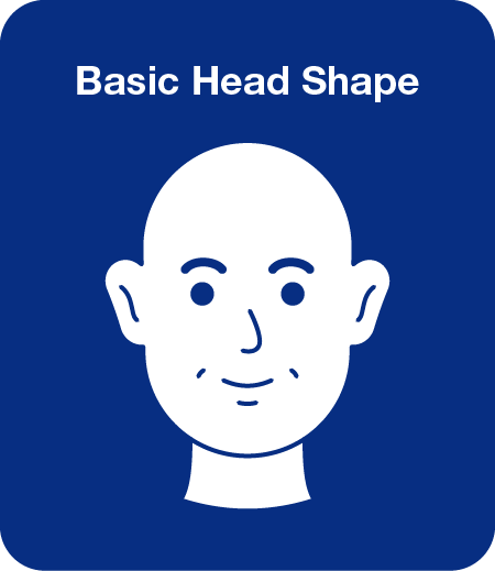
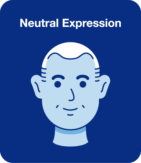
We developed a modular approach to adding people to the CAASCO illustration style, so that the same details could be repurposed across various assets. Ethnicity: CAA SCO wanted to find a way to emphasise human interaction in their illustration style that would reflect their diverse customers. We devised a modular approach that takes one shape and expresses it many ways. Sometimes simple is more. Note how limited palette is able to express many skin tones without having to deal with the intricacies of many shades within natural skin tones.
Emotion: The many faces of the CAA SCO human. With simple modifications a full range of emotions are possible to the CAA-style illustrated face. Simple elements expressed many ways.
Illustrating the Art of Lifestyle
Once the illustration style was finalized, we created a number of brand illustrations that embody the essence and values of the organization.– care, neighbourliness, having Member’s backs. The illustration themes span a wide range of subjects to reflect the diverse lives of their audience, acknowledging and celebrating the unique experiences and backgrounds that shape their individual stories. These are defining moments – the moments that act as touchpoints for community, family, and living our best lives.


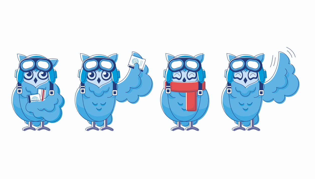
"Travel Wise," introduces a new character who encapsulates the spirit of safe and informed journeying.
Meet Earhart, a saavy traveler whose design elegantly fuses the great grey owl, with whimsical elements from its avian cousins. His appearance, marked by a dark ring around his observant eyes and distinctive horned ears, resonates with a unique visual flair that aligns with CAA's icon style. Crafting Earhart wasn't merely about form but also function. To bring him to life within the constraints of an iconized style, subtle yet expressive emoticons are placed close to him, enhancing his ability to convey a wide range of emotions. It’s like watching a silent film where every raised eyebrow or surprised look tells a part of the story.

Animating Illustrations
One of the things we love, is talking an illustration and bringing it to life . Our illustrators and animators work together at the conceptual stage to ideate how a composition could be animated. Depending on the need, and the constraints of the job, those animations may be subtle or more complex, but they always enhance the storytelling.
Advertising Campaign
Overdrive was tasked with developing a campaign for the Membership line of business. We developed the concept of “Take CAA along the Way” to express the many ways CAA is able to provide aid, discounts, travel advice and more. We used the icon style of illustration to illustrate both static and animated versions of the ads, which were deployed as both display ads and in social media platforms. While the campaign is over, the illustrations and animations continue to live on in new guises.
Credits
Overdrive Design: Creative, concepts and design
“I have worked with Overdrive Design for 15 years. In 2020 they developed the CAA SCO brand system and playbook with myself and my team. James’s combination of strategic thinking, patience and creative solutioning provided us the tools to help reinvent the CAA SCO brand. But even more importantly, Overdrive’s big picture thinking ensured that this exercise was the basis on which we could evolve our CAA Insurance and create a new CAA Club Group parent brand. Overdrive was integral in our ability to tackle one of the most complex brand systems I have ever had to deal with and come out the other side with simple, cost effective solutions that just feel perfect for CAA.”
Brent Closs, CAA SCO


