CAA Insurance Broker Conference

Driving Broker Engaement Event Branding for CAA Insurance's annual conference.
Project Snapshot
Client
: CAA InsuranceIndustry
: Insurance, Finance & Regulated BrandsServices
: Event Branding · Visual Identity · Campaign Design · Illustration · Environmental Graphics · Presentation MaterialsChallenge
: Create a cohesive broker conference identity that felt engaging, professional and unmistakably connected to the CAA Insurance brand.Outcome
: A branded event system that gave CAA Insurance a consistent, recognizable presence across conference materials, presentations, signage and broker communications.
CAA Insurance celebrates their broker community with an annual event that combines networking with education and dash of entertainment. Its an opportunity to reinforce the CAA Insurance brand, including their visual messaging. Our objective was to create one overarching concept that could express this year’s theme "Drive Progress. Embrace Change.” across the full conference experience including digital, interactive, event collateral, signage and wayfinding.


Portal to Progress
Overdrive created an illustrative motif featuring three characters moving through portals, representing the momentum, transformation, and human impact shaping the insurance industry today. The idea of a portal is readily associated with entering a new space, and we had the perfect reference– the oval in the CAA Insurance logo. Repeated and layered, the ovals became a recognizable visual language that suggested future possibility while staying closely tied to the parent brand. Meanwhile the three characters emerge from and interact with the portals, each reflecting a mindset at the heart of the conference theme: wonder, discover, and embrace.


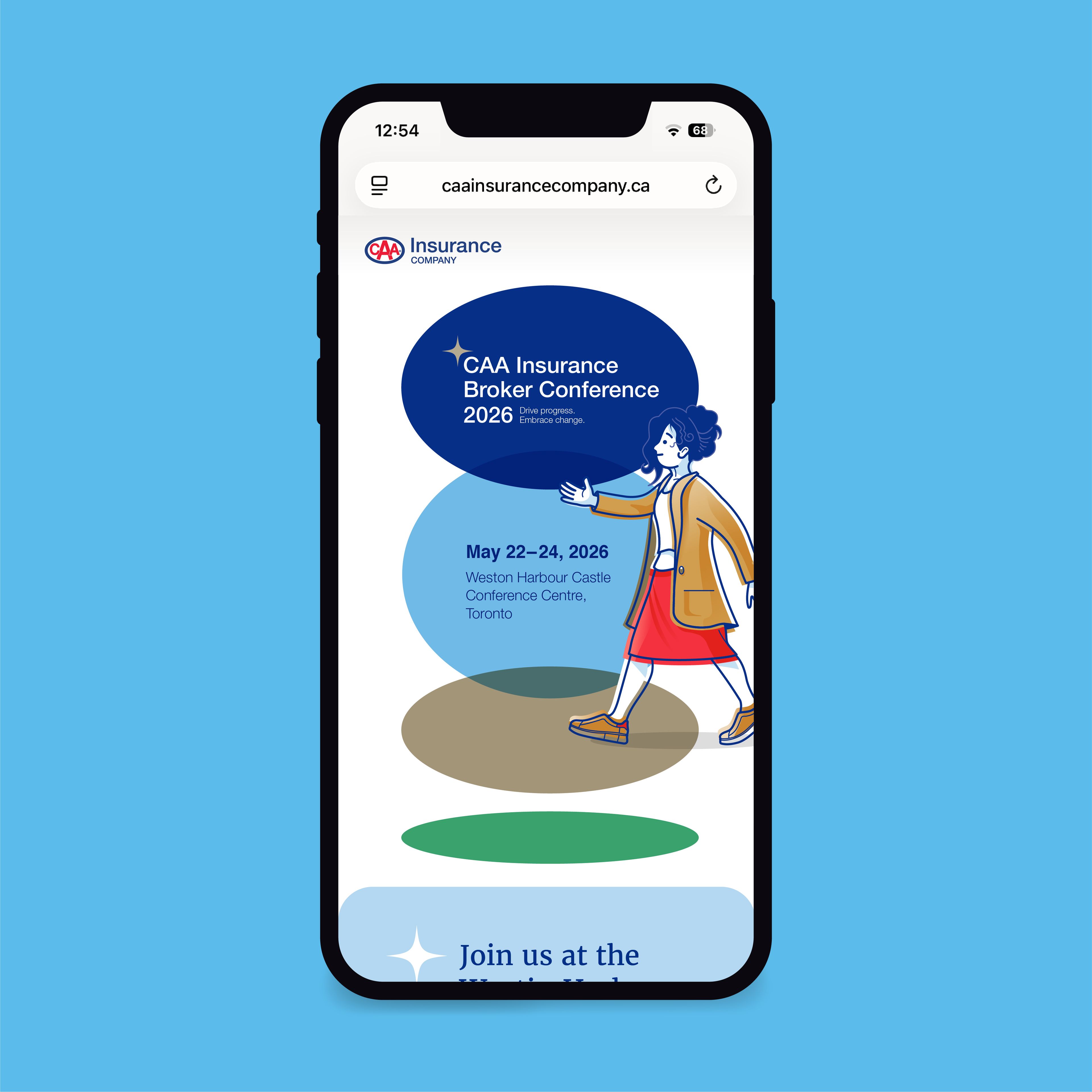
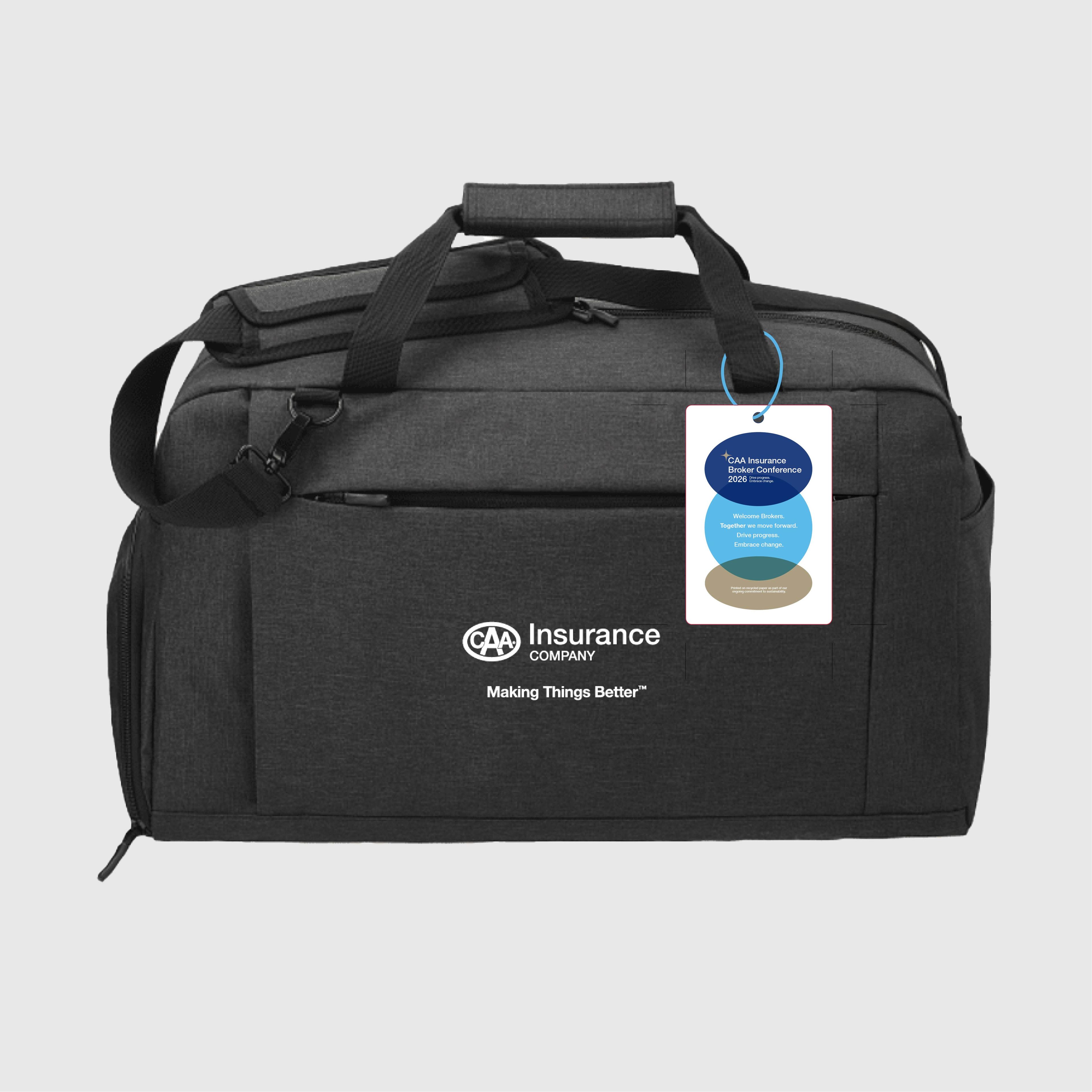


Embracing the spectrum of conference collateral
A confernence visual identity needs to be deployed across a variety of elements: name tags, invites, web pages, swag, emailers. It also needs to provide awareness and wayfinding for attendees, within the larger environment of a hotel or a conference center. The portal forms, overlapping motion, and character-driven vignettes provided enough visual building blocks to allow us to explore variations on the theme across the conference collateral. The signage and wayfinding were designed to leverge specific locations and needs across the convention centre, making the conference brand stand out and connect with attendees.

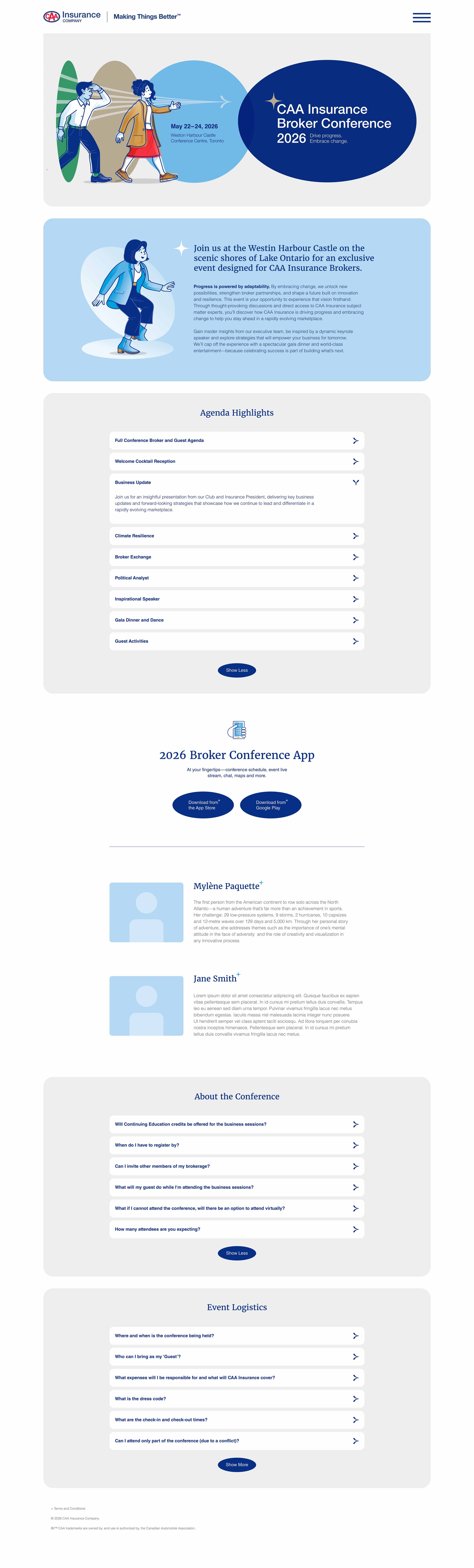



Design and Illustration: Overdrive Design


