Sistering. A Women’s Place.
PROJECT
Rebrand
Sistering, A women’s’ place: reaching for a re-brand worthy of the cause.
DESCRIPTION
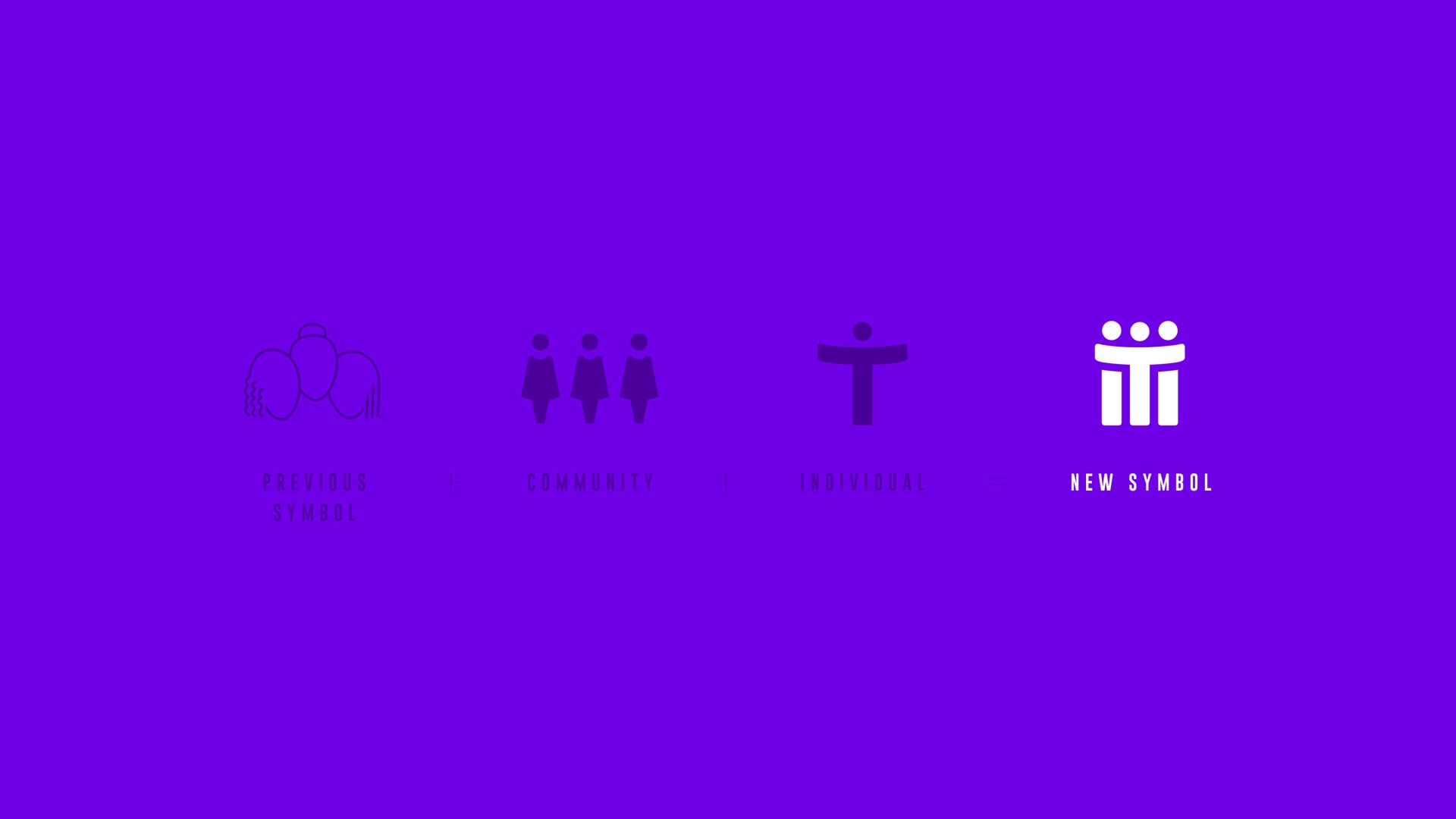
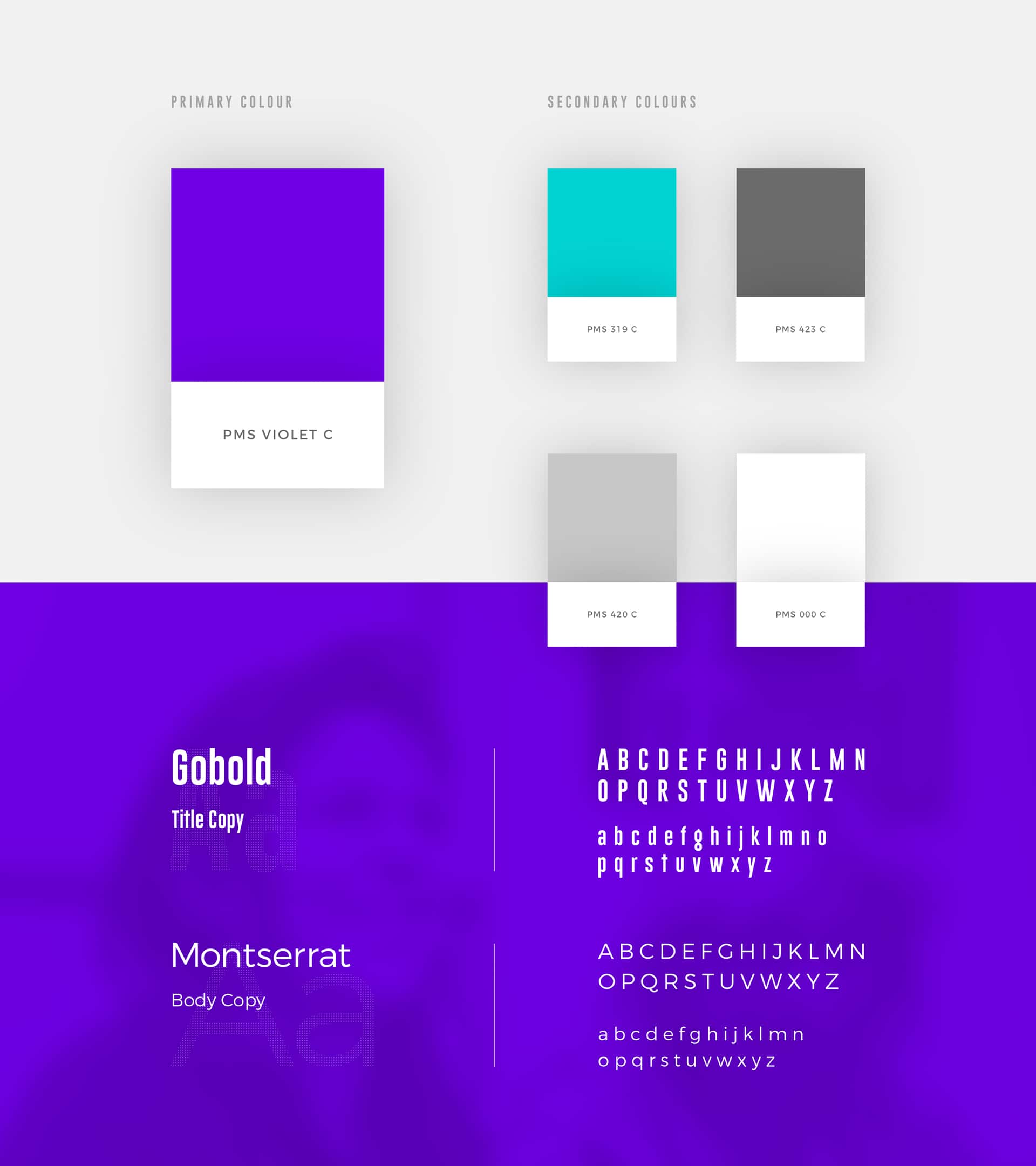
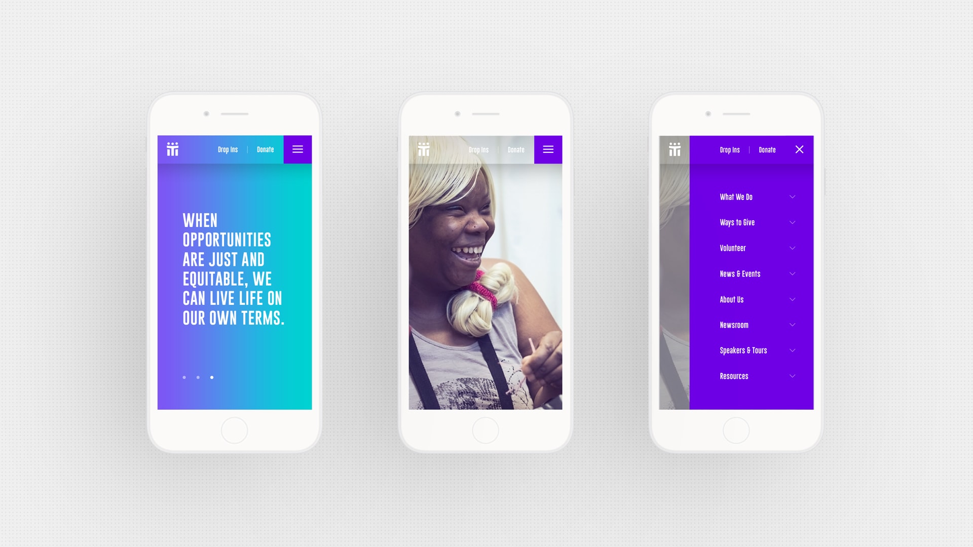
Sistering, a Toronto based drop-in center, was founded and focused on serving homeless and precariously-housed women. Sistering has been a major player in supporting women at risk, yet their website made the organization appear less credible and dated. Although Sistering had freed up a budget to redo their website, in conversation we learned that they were thinking of redoing their identity at some point. We explained the relationship that exists between identity and website. Ideally, a website would evolve from the many design decisions made when establishing an identity. By developing a new website before a new logo, the website would reflect the old logo, or alternatively minimize the old logo so that the website would exist as a “one of” rather than as part of an integrated brand. Luckily, Sistering chose to start with a new identity. We worked with Sistering stakeholders to design a new logo that would bring the organizations’ visual identity into the new millennium. We created a symbol that reflected a caring community between women, with a colour palette that reflected the historic importance of the colour purple to the feminist movement.
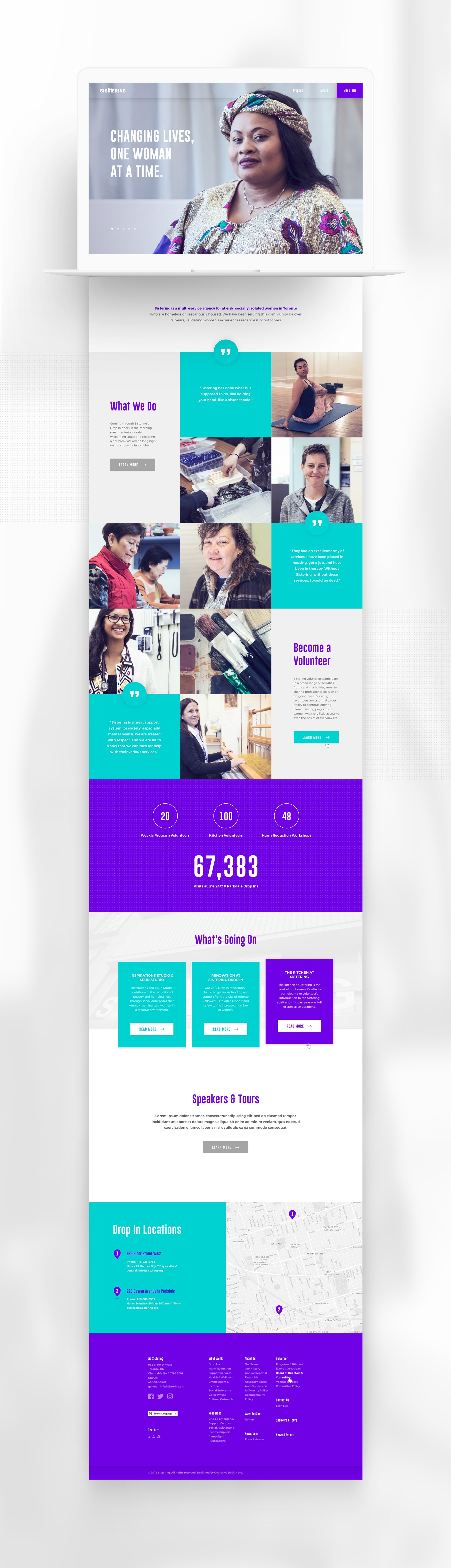
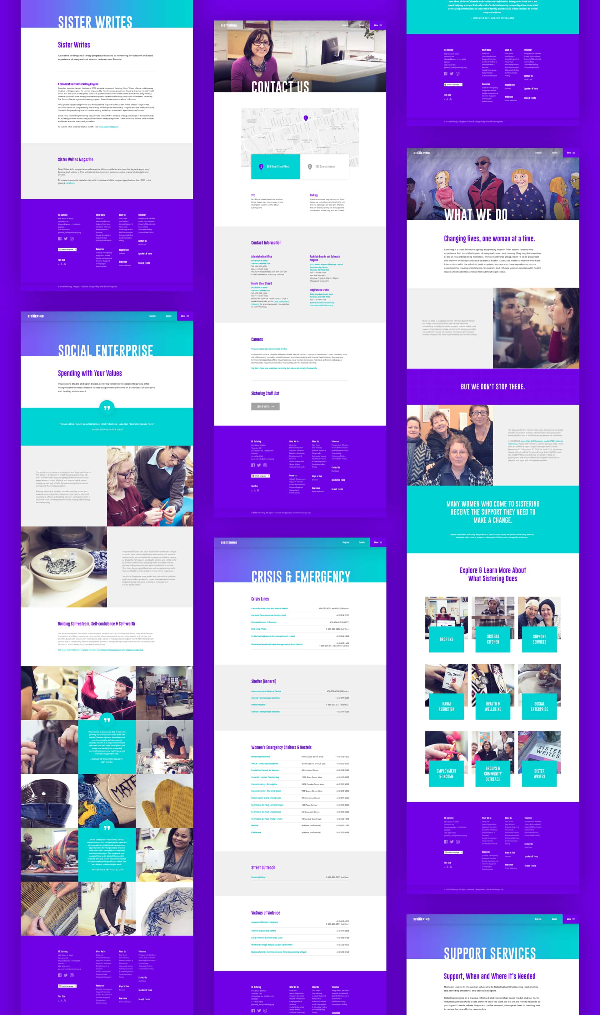
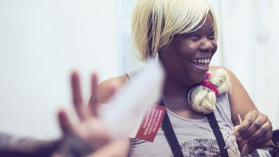
With the identity established, we turned to the re-design of Sistering’s website. We began by listening to how the organization saw itself, as well as how they wanted to be perceived by both the public AND potential donors. The Sistering staff felt that their old website reflected their identity and goals. They had an attachment to it, despite the fact that the navigation was convoluted and the UI was not intuitive. Moreover, aesthetically, there was no design consistency as new components and campaigns had simply been bolted onto an older existing site. In short, there was a disconnect between Sistering’s understanding of their goals and aspirations – and their forward-facing public identity. Addressing this disconnect was especially important because their goals included capturing a larger slice of donor dollars and attracting younger volunteers. Through a careful audit of the existing site, Overdrive was able to streamline Sistering’s content, removing redundancies, and creating navigation and a user interface that was intuitive. We clarified the esthetic so that it not only made sense internally but communicated the goals, mission and character of Sistering to a larger pubic audience. Photography played a large part in this exercise, and the tone of the images- many of which depicted the participants- was very important. Participants were depicted in an uplifting way, showing their strengths and character rather than as victims.
DELIVERABLES
Web Design and Development, Logo Design, Stationary, Brand Expression.
CREDITS
Overdrive Design – Design
Marc Alcide – Development
Charlotte Empey (FYI Media) – Copy
Melissa Renwick – Photography
LINKS
Visit the Sistering website: sistering.org